Disappearing lighthouses: atmospheric refraction at Portobello beach

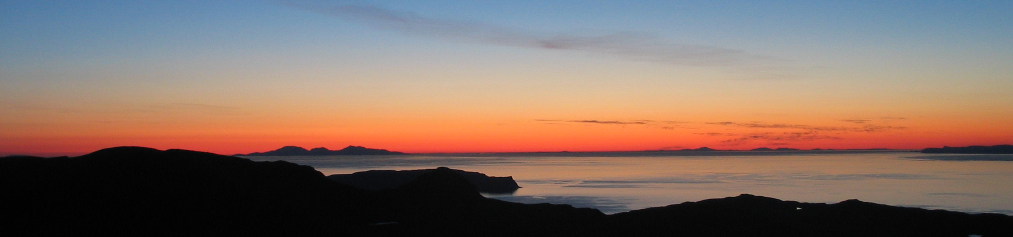
Look out to sea at night from the beach at Portobello in Edinburgh, and you’ll often see lighthouses blinking in the blackness. Here’s a picture of those lights, taken in such a way as to convert time into space so that the different flashing sequences become apparent.

I pointed my camera out to sea, on a tripod, and slowly panned upwards over what was effectively a long exposure of about a minute. The movement of the camera smears out any light source into a near-vertical streak (the tripod wasn’t very level). The two thick streaks are ships at anchor in the Firth of Forth.

A flashing light leaves a broken streak; this reveals the lighthouses. At the left is Elie Ness on the Fife coast, flashing once every 6 seconds. Second from the right is the Isle of May in the Firth of Forth, flashing twice every 15 seconds. And at far right we have Fidra, off North Berwick, flashing 4 times every 30 seconds.

And the green streak? A passing dog with a luminous collar!

Lighthouses are lovely, romantic, things. But what’s extra lovely about the lighthouses in this image is that you shouldn’t be able to see two of them!

Both the Elie Ness and Isle of May lighthouses are, geometrically, beyond the horizon. If light travelled in straight lines, we wouldn’t be able to see either of them. As it is, whether we can see them or not depends upon the weather: if I’d taken the picture in cold weather, only the Fidra light would have been visible.

Isle of May lighthouse. Image: Jeremy Atherton.

The reason that we can see them at all is that light travelling through the atmosphere is refracted by the air: its path is (usually) slightly curved downwards. This means that we can see slightly “over the hill”, a bit further than simple geometry would suggest. Things near the horizon appear higher in the sky than they really are.

It’s not a small effect. For example, when we see the Sun sitting with its lower edge just touching the horizon, the geometric reality is that all of it is actually below the horizon.

The refraction happens because the air gets thinner as you go upwards. Just as light passing through a prism is bent towards the thicker end of the prism, so light passing through the atmosphere is bent towards the thicker (denser) part of the air.

Elie Ness lighthouse. Image: Francis Webb.

The amount of atmospheric refraction depends upon the weather. It depends upon the pressure and temperature, and the temperature gradient (how quickly the temperature drops as you go upwards). When it’s cold, the Elie Ness and Isle of May lights disappear. If it warms up, they pop back into view again. And when it’s really cold and the air is colder than the sea, the refraction can be reversed, and we see mirages along the coast. But that’s for another time.

Mirages on the Fife coast, seen from Portobello (distance about 8 miles/13km). Early April, with air temperature forecast to be about 0° C. The sea temperature was about 7° C.

How horizons work, and how we see things that are beyond the horizon

The horizon exists because the Earth’s surface is curved. In these diagrams the circular arc represents the surface of the Earth. If my eye is at the point O, I can see the Earth’s surface up to the point H (where my line of sight just grazes the surface) but no further. The point H is on my horizon. Its distance depends upon the height of O. It can be surprisingly close: if I stand at the water’s edge, my horizon is only 4.5 km away.


If the thing I’m looking at (a lighthouse L for example) is raised above the surface of the Earth, I’ll be able to see it when it is further away. In the diagram below, I’ll just be able to see the lighthouse. The rays from the lighthouse will just kiss the wave tops in the darkness on their way to my eye. The point is on the lighthouse’s horizon as well as mine. The higher the lighthouse (or me) is, the further away it can be and I’ll still see it.


But if it’s too far away (below), I won’t be able to see it. There’ll be a region of the sea that is not in sight from either my eye or the lighthouse. This “no-man’s land” is the region between my horizon H_O and the lighthouse’s horizon H_L. For example, there’s about 6 km of no-man’s land between me on the promenade at Portobello and the Isle of May lighthouse.


All of these diagrams assume that rays of light are perfectly straight. But rays of light passing through the air aren’t perfectly straight: they have a downward curvature because of atmospheric refraction. This means that rays from an object that is geometrically beyond the horizon might actually reach my eye. That’s why I can sometimes see the Elie Ness and Isle of May lights. 

The curvature of the rays of light is hugely exaggerated in this diagram. Otherwise it would be imperceptible. The rays deviate from straightness by only a few metres over a journey of several tens of kilometres.

The curvature of the rays varies according to temperature, pressure etc. It’s a happy accident (for me) that both lighthouses are only marginally out of view over the horizon, so that they can disappear and reappear according to the whims of the weather.

How I took the picture

The picture isn’t actually a single long exposure. I thought that I might end up with a pale sky rather than a black one if I did that. Instead, I took a one-minute video, slowly panning the camera upwards. I then wrote a program in Python to produce a composite image derived from all of the video frames. For each pixel position in the image, the program inspected that pixel position in all of the video frames and chose the brightest value.

Calculating the distance of the horizon

We can use Pythagoras’ theorem to work out how far away the horizon is. In the diagram below, the circle represents the surface of the Earth, with centre at C and radius r. You, the observer, are at O, a height h (greatly exaggerated) above the surface. Your horizon is at H, a distance d away.

The triangle OHC is right-angled at H. Applying Pythagoras’ Theorem, we get
(r+h)^2 = d^2 + r^2
and so
d^2 = r^2 + 2rh + h^2 - r^2

Where h is very small compared to r, as it will be for the heights we’re dealing with, h^2 \ll 2rh, so we can neglect the term h^2 and get, to a very good approximation (within centimetres)
d = \sqrt{2rh}

Calculating the visibility of the lighthouses

There is a Wikipedia article with formulae for the curvature of near-horizontal light rays in the atmosphere.

I’m only going to give a summary of results here, principally because although I’ve got the spreadsheet that does the calculations, I can’t find the notebook where I worked out the geometry. Here are the details of the lighthouses. Heights are the height of the lamp in metres above mean sea level.

LighthouseDistance (km)Height above sea level (m)
Isle of May4473
Elie Ness3115
Fidra2434

Consider the next table as an example, based on roughly typical weather conditions for this time of year (March). The figures assume that I’m standing on Portobello promenade. The Ordnance Survey map shows a 3 metre spot height marked on the prom, so that would make my eye about 4.5 metres above mean sea level.

The first three numerical columns of the table shows how high above the horizon each lighthouse would be in the absence of refraction, what the estimated refraction is, and thus how high above the horizon the light should appear. The heights are expressed as angles subtended at your eye. There’s a lot of uncertainty in the estimated refraction (because of uncertainty about the input values such as temperature gradient), which is why the middle two columns are given to only one significant figure.

LighthouseAngle above horizon with no refraction (degrees)Estimated refraction (degrees)Estimated angle above horizon with refraction (degrees)Water depth over direct line of sight (m)
Isle of May-0.0400.0490.015.3
Elie Ness-0.0510.035-0.026.8
Fidra0.0300.0270.06-4.1

Thus we see that the Isle of May and Elie Ness have negative heights above the horizon without refraction, ie they’re geometrically below the horizon. In the conditions given, refraction is enough to raise Isle of May into visibility, but not Elie Ness – the angle with refraction is still negative. This accords with my experience: I’m more likely to be able to see Isle of May than Elie Ness. Fidra is above the horizon, refraction or no refraction.

Note that the angles above and below the horizon are tiny. For comparison, an object 1 mm across held at arm’s length subtends an angle at your eye of about 0.1 degrees. Most of the angles in the table are less than half that.

The rightmost column is there to help understand how the tide can affect things. Saying that the Isle of May and Elie Ness lights are beyond the horizon is saying that there’s water between my eye and their lamps. Imagine that the light from the lamps could travel through the water completely unimpeded and in a perfect straight line to my eye. This column shows how far under the water the light rays would be at their deepest. As you can see, they are single-digit numbers of metres. Now the tidal range in the Firth of Forth is about 4 metres. What this shows us that that the state of the tide could easily make the difference between seeing or not seeing a given lighthouse. It also brings home how slight a curvature of the rays is produced by refraction: in Isle of May’s case, there’s just enough curvature to get the rays over a 5-metre bump in a 44-kilometre journey.


Image credits

Isle of May: Jeremy Atherton; Elie Ness: Francis Webb. Both under CCA license.

Galactic greenhouse

Before Christmas, my enterprising friend Clare decided to brighten the dark nights of a Scottish winter by turning her greenhouse into an illuminated art gallery. She asked friends to produce translucent artworks that could be hung in the greenhouse and lit from within.

My contribution is a representation of the movement across the sky of Jupiter and Saturn (and some smaller planets) in the two years bracketing the recent Great Conjunction. It’s made from a sheet of wallpaper, painted black, with holes cut out and with coloured filters placed behind the holes.

A photograph of the piece. It’s just over 50 cm wide. The variations in brightness of the discs aren’t part of the plan; the illumination wasn’t perfectly even.

The piece is divided into 30 rows. All but one of these rows contain a large red disc (representing Jupiter) and a large yellow disc (representing Saturn). A row may also contain smaller discs, representing Mars in pink, Venus in white and Mercury in blue. The purple discs represent the ex-planet Pluto. All of the discs hugely exaggerate the size of their planets.

Each row represents the same strip of the sky, in the sense that if I had included stars on the piece, the same stars would appear in the same positions on every row. From top to bottom, the rows show that strip of sky at 25-day intervals, covering a period roughly from roughly one year before the Great Conjunction to one year after. The discs in each row indicate the positions of any planets that are in that strip of sky at the time.

Concentrating on Jupiter (red) and Saturn (yellow) first, we see that they have a general leftward motion, but with periods of rightward motion. Jupiter’s overall leftward motion is faster than Saturn’s: it starts to the right of Saturn and finishes to the left. Because Jupiter overtakes Saturn, there comes a point where they are at the same place in the sky. This is the Great Conjunction: in this row, both Jupiter and Saturn are represented by a single large white disc.

Mars, Venus and Mercury move much faster. Mars crosses our field of view in only 4 rows (roughly 100 days) and Venus and Mercury make repeat visits. Pluto wavers back and forth without appearing to make much leftward progress at all.


The FAQ

Why do the planets move along the same line? They don’t exactly, but it’s pretty close. All of the planets, including the Earth, move around the Sun in roughly circular orbits. Except for Pluto’s, these orbits are more or less in the same plane (like circular stripes on a dinner plate). Because our viewpoint (the Earth) is in this plane, we look at all the orbits edge on, and the planets appear to follow very similar straightish paths across the sky. I have chosen to neglect the slight variations in path and depict the planets as following one another along exactly the same straight line

Why do Jupiter and Saturn move mainly right to left? Looking down from the North, all of the planets orbit anticlockwise. Mars, Jupiter, and Saturn have bigger orbits than the Earth, we’re observing them from inside their orbits (and from the Earth’s northern hemisphere). Thus their general movement is leftwards. (If you don’t get it, whirl a conker around your head on a string, so that it moves anticlockwise for someone looking down. The conker will move leftwards from your point of view.) The orbits of Venus and Mercury are inside the Earth’s orbit; their movements as seen from the Earth are rather complicated.

Why do Jupiter, Saturn, and Pluto sometimes move from left to right? Earth is in orbit too, so we’re observing the planets from a moving viewpoint. If you move your head from side to side, nearby objects appear to move back and forth against the background of distant objects. Exactly the same effect happens with our view of the outer planets as the Earth moves around its orbit from one side the Sun to the other – they appear to move back and forth once a year against the background of distant stars. But at the same time, they are also really moving leftwards (as we look at them). The sum of the planet’s real motion with their apparent back-and-forth motion gives the lurching movement that we see: mainly leftwards but with episodes of rightward motion. Note that the planets never actually move backwards: they just appear to. The same thing happens to Mars, but none of its periods of retrograde motion coincided with its visit to our strip of the sky.

Why do some planets move faster across the sky than others? The larger a planet’s orbit, the more slowly it moves. For the outer planets, a larger orbit also  means that we’re watching it from a greater distance, so it appears to move more slowly still. Saturn’s orbit is about twice as big as Jupiter’s, so it moves more slowly across the sky than Jupiter. Jupiter “laps” Saturn about once every 20 years: these are the Great Conjunctions. Mars’ orbit is smaller than Jupiter’s, so it moves more quickly across the sky. Meanwhile lonely Pluto plods around its enormous orbit so slowly that the leftward trend of its motion is barely discernible; all we see is the side-to-side wobble caused by our own moving viewpoint. As for Mercury and Venus: it’s complicated.

Please could you stop being evasive about the movements of Venus and Mercury? It really is complicated. The orbits of Venus and Mercury are smaller than the Earth’s: we observe them from the outside. If the Earth was stationary, we’d see Venus and Mercury moving back and forth from one side of the Sun to the other. Returning to our conker-whirling experiment, it’s like watching a conker being whirled by somebody else rather than whirling it yourself. But the Earth is moving around its orbit too. And then Venus and Mercury are also moving rather fast: Mercury orbits the Sun 4 times for each single orbit made by the Earth. Combine all of these things and it becomes very confusing. Whereas the outer planets’ episodes of retrograde (backwards) movement across the sky occur less than once a year, Mercury is retrograde about three times a year.

Do the planets really follow a horizontal path across the sky? This question doesn’t have an answer. We’re using the pattern of stars, all inconceivably distant compared to the planets, as the fixed background against which we view the movement of the planets. You may have noticed that the stars move in arcs across the sky during the night; this is due to the Earth’s rotation on its axis. So our strip of sky moves in an arc too, and turns as it moves. So if it ever is horizontal, it is only briefly so, and when and if it is ever horizontal will depend upon your latitude.

Jupiter and Saturn never exactly lined up, did they? No, they didn’t (see the answer to the first question). On this scale, at the Great Conjunction the discs representing Jupiter and Saturn should be misaligned vertically by about a millimetre. With our hugely over-sized planets, this means almost total overlap, which still misrepresents the actual event, where the planets were separated by many times their own diameter. And for all other rows, where the two discs don’t overlap, a millimetre’s misalignment would be imperceptible. A final and maybe more compelling reason for my neglect of the misalignment of the planets’ paths is that I don’t know how to calculate it.

Anything else to confess?  Yes. There’s a major element of fiction about the piece in that it’s not physically possible to see all of these arrangements of the planets. The reason is that for some of these snapshots, the Earth is on the opposite side of the Sun from most or all of the planets, and Sun’s light would drown out the light from the planets. In other words, it would be daytime when the planets are above the horizon, and therefore in practice they would be invisible. This was almost the case for the Great Conjunction, where there was only a short period of time between it becoming dark enough for Jupiter and Saturn to be visible, and them disappearing over the horizon.

A further element of fiction is that, even in the depths of a Scottish winter’s night, Pluto is far too faint to be seen with the naked eye, not to mention not being regarded by the authorities as a planet any more. But it was passing at the time of the Great Conjunction and it seemed a pity to miss it out.


Why hillwalkers should love the Comte de Buffon

Part of Beinn a Bhuird, Cairngorms, Scotland.

Wandering the mountains of the UK has been a big part of my life. You won’t be surprised that before I start a long walk I like to know roughly what I’m letting myself in for. One part of this is estimating how far I’ll be walking.

Several decades ago my fellow student and hillwalking friend David told me of a quick and simple way to estimate the length of a walk. It uses the grid of kilometre squares that is printed on the Ordnance Survey maps that UK hillwalkers use.

To estimate the length of the walk, count the number of grid lines that the route crosses, and divide by two. This gives you an estimate of the length of the walk in miles.

Yes, miles, even though the grid lines are spaced at kilometre intervals. On the right you can see a made-up example. The route crosses 22 grid lines, so we estimate its length as 11 miles.

Is this rule practically useful? Clearly, the longer a walk, the more grid lines the route is likely to cross, so counting grid lines will definitely give us some kind of measure of how long the walk is. But how good is this measure, and why do we get an estimate in miles when the grid lines are a kilometre apart?

I’ve investigated the maths involved, and here are the headlines. They are valid for walks of typical wiggliness; the rule isn’t reliable for a walk that unswervingly follows a single compass bearing.

  • On average, the estimated distance is close to the actual distance: in the long run the rule overestimates the lengths of walks by 2.4%.
  • There is, of course, some random variation from walk to walk. For walks of about 10 miles, about two-thirds of the time the estimated length of the walk will be within 7% of the actual distance.
  • The rule works because 1 mile just happens to be very close to \frac{\pi}{2} kilometres.

The long-run overestimation of 2.4% is tiny: it amounts to only a quarter-mile in a 10-mile walk. The variability is more serious: about a third of the time the estimate will be more than 7% out. But other imponderables (such as the nature of the ground, or getting lost) will have a bigger effect than this on the effort or time needed to complete a walk, so I don’t think it’s a big deal.

In conclusion, for a rule that is so quick and easy to use, this rule is good enough for me. Which is just as well, because I’ve been using it unquestioningly for the past 35 years.

And the Comte de Buffon?

The Comte de Buffon

George-Louis Leclerc, Comte de Buffon,  (1707-1788) was a French intellectual with no recorded interest in hillwalking. But he did consider the following problem, known as Buffon’s Needle:

Suppose we have a floor made of parallel strips of wood, each the same width, and we drop a needle onto the floor. What is the probability that the needle will lie across a line between two strips?

Let’s recast that question a little and ask: if the lines are spaced 1 unit apart, and we drop the needle many times, what’s the average number of lines crossed by the dropped needle? It turns out that it is

\dfrac{2l}{\pi}

where l is the length of the needle. Now add another set of lines at right angles (as if the floor were made of square blocks rather than strips). The average number of lines crossed by the dropped needle doubles to

\dfrac{4l}{\pi}

Can you see the connection with the distance-estimating rule? The cracks in the floor become the grid lines, and the needle becomes a segment of the walk. A straight segment of a walk will cross, on average, \frac{4}{\pi} grid lines per kilometre of its length. Now a mile is 1.609 kilometres, so a segment of the walk will, on average, cross \frac{4}{\pi} \times 1.609 = 2.0486... grid lines per mile, which is very close to 2 grid lines per mile, as our rule assumes. If a mile were \frac{\pi}{2} km (1.570… km), we’d average exactly 2 grid lines per mile.

So the fact that using a kilometre grid gives us a close measure of distance in miles is just good luck. It’s because a mile is very close to \frac{\pi}{2} kilometres.

In a future post, I’ll explore the maths further. We’ll see where the results above come from, and look in more detail at walk-to-walk variability. We’ll also see why results that apply to straight lines also apply to curved lines (like walks), and in doing so discover that not only did the Comte de Buffon have a needle, he also had a noodle.

Mathematical typesetting by QuickLaTeX.


Decisions of cricket umpires

In this post I offer a suggestion for a practically imperceptible change to the laws of cricket that might eliminate controversies to do with adjudications by match officials. The suggestion could apply to any other sport, so even if you aren’t a cricket lover, please read on.

My suggestion doesn’t affect the way the game is played in the slightest. It simply takes a more realistic philosophical angle on umpires’ decisions.

Cricket is a bat-and-ball ‘hitting and running’ game in the same family as baseball and rounders. In these games, each player on the side that is batting can carry on playing (and potentially scoring) until they are “out” as a result of certain events happening. For example, in all of these games, if a batsman* hits the ball and the ball is caught by a member of the other team before it hits the ground, the batsman is out.

In cricket, there are several ways that a batsman can be out. Some of these need no adjudication (eg bowled), but most require the umpire to judge whether the conditions for that mode of dismissal have been met. In the case of a catch, for example, the umpire must decide whether the ball has hit the bat, and whether it was caught before touching the ground. Contact with the bat is most often the source of contention, because catches are often made after the ball has only lightly grazed the edge of the bat.

The umpire’s position is unenviable. They have to make a decision on the basis of a single, real-time, view of the events, and their decisions matter a great deal. The outcome of a whole match (and with it, possibly the course of players’ careers) can hinge on one decision. It’s not surprising that umpire’s decisions are the cause of much controversy.

For most of the history of cricket, the on-field umpire’s judgement has been the sole basis for deciding whether a batsman is out. This is still true today for nearly all games of cricket, but at the highest levels of the game, an off-field umpire operates, using slow motion video, computer ball-tracking, and audio (to hear subtle contact of the ball with the bat). The on-field umpires (of which there are two) can refer a decision to the off-field umpire, and the players have limited opportunities to appeal against the decisions of the on-field umpires. From now on we’ll call the off-field umpire the “3rd umpire”, as is commonly done.

One of the intentions behind all of this was to relieve the pressure on the on-field umpires, but it appears that the opposite has been the case. In a recent Test Match between England and Australia, one of the umpires had 8 of his decisions overturned on appeal to the 3rd umpire. This led to much criticism and must have been excruciating for him.

Here’s a suggestion for a small modification to the laws of cricket that wouldn’t change the course of any match that didn’t have a 3rd umpire, but which would put the on-field umpires back in charge and relieve much of the pressure on them. As a bonus, it would settle another thorny issue in the game – whether batsmen should “walk” or not (see later).

The suggestion

I’ll use the judgement “did the ball touch the bat?” as an example, but the same principle applies to any judgement of events in the game. We’ll assume that the ball was clearly caught by a fielder, so that contact with the bat is the only matter at issue.

There are three elements to an umpire’s decision: the physical events, the umpire’s perception of those events, and the decision based on that perception. We can represent these elements in a diagram:

For our specific example, the diagram looks like this:

Because our perceptual systems are imperfect, the umpire’s perception of events doesn’t necessarily correspond to the actual course of events. They may perceive that the ball has hit the bat when it hasn’t, or vice versa. This source of error is represented by linking the left-hand boxes by a dashed arrow.

On the other hand, the umpire has perfect access to their own perceptions, so the final decision (out/not out) follows inevitably from those perceptions (provided that the umpire is honest). This inevitable relationship is represented by linking the right-hand boxes by a solid line.

Now, at present, the law is specified in terms of the physical events that occurred. This means that, because the umpire’s perception is imperfect, the umpire can make an incorrect decision: one that is not in accord with those physical events.

However, in any match without a 3rd umpire (ie practically all cricket) the umpire is the sole arbiter of whether a batsman is out or not. So regardless of the actual laws, the de facto condition for whether a batsman is out is the umpire’s perceptions, not the physical events, like this:

My suggestion is simply to be honest about this state of affairs and enshrine it in the laws.

Thus, the relevant part of the law, instead of reading (as it does at present):

…if [the] … ball … touches his bat…

would read

…if the ball appears to the umpire to touch the bat (regardless of whether it did actually touch the bat)…

This may seem like a strange way to word the law, but it’s just codifying what happens anyway in nearly all cricket. The course of all cricket matches that don’t have 3rd umpires, past, present, and future, would be entirely unchanged. We’d be playing exactly the same game. The only difference is that all umpires’ decisions would, by law, be correct, and so the pressure on them would be removed.

The other main advantage of my proposal would that it would render 3rd umpires and all their technology irrelevant, and we could get on with the game instead of waiting through endless appeals and reviews. Cricket would once again accord with the principle that a good game is one that can be played satisfactorily at all levels with the same equipment. And the status of the umpires would be restored to being arbiters of everything, rather than being in danger of being relegated to mere ball-counters and cloakroom attendants.

The opposition

I have to confess that no-one I’ve spoken to thinks that this is a good idea. There seem to be two counterarguments. The first is somewhat vague – that there’s something a bit airy-fairy about casting the law in terms of events in someone’s brain rather than what actually happened to balls and bats. I might agree with this argument if my proposal actually changed the decisions that umpires make, but it doesn’t – the only things that change are the newspaper reports and the mental health of umpires.

The second counterargument is more substantial. Under my proposal, even an umpire with spectacularly deficient vision could never make an incorrect decision. Likewise, a corrupt umpire would have a field day (so to speak). Yet quite clearly, we do only want to employ umpires whose decisions are generally “accurate”, in the sense that they reflect what actually happened. My proposal is quite consistent with maintaining high umpiring standards. At the beginning of any match, we appoint umpires, and by doing so we define their decisions to be correct for that match. That doesn’t stop us later (say, at the end of the season) reviewing their decisions en masse and offering training (or unemployment) if the decisions appear to consistently misrepresent what actually happened. Again, this is roughly what actually happens at the moment. Players (usually) accept the umpire’s decision as it comes, but at the end of the game, the captains report on the standard of umpiring. All I’m doing is changing the way we regard the individual decisions.

To walk or not to walk?

My proposal eliminates another controversy in the game: what does a batsman do if they know that the ball has touched their bat and been caught, but the umpire doesn’t see the contact and gives them “not out”?

Some people say that the batsman should “walk” – that is, give themself “out” and head for the pavilion. Others say that the batsman should take every umpire’s decision as it comes, never “walking”, but also departing without dissent if they have been wrongly given “out”. It is possible to make a consistent and principled argument for either position.

With my version of the laws, all of this argument vanishes. Only one position is now valid: batsmen should never “walk”. A batsman may feel the ball brush the edge of their bat on its way to the wicket-keeper’s gloves, but if the umpire perceives that no contact occurred, it is not a mistake – the batsman is purely and simply not out under the law.


* Batsman or batter?

In recent years the term batter has come into use alongside batsman, in some cases as a conscious effort to use a gender-neutral term. It’s interesting to note that the women’s cricket community doesn’t seem to be particularly enthusiastic about batter (nor indeed batswoman) and there seems to be a long-standing preference for batsman. See, for example, this blog post, which explores the history of the matter a little. Note also that since 2017 the Laws of Cricket have been written in a gender-neutral style using he/her his/her throughout, but nevertheless retain batsman. My understanding is that this has been done in consultation with the women’s cricket community.


Bradycardia

Here again is the processor package from my old laptop. The processor has a clock in it that delivers electric pulses that trigger the events in the processor. The clock on this processor “ticks” at 2.2 gigahertz, that is, it sends out 2.2 billion pulses per second.

Over two thousand million pulses every second! How can we make sense of such a huge number?

In this post, I’m going to do with time what I did with space in the previous post. I’m going to ask the question:

Suppose that we slow down the processor so that you could just hear the individual “ticks” of the the processor clock (if we were to connect it to a loudspeaker), and suppose that we slow down my bodily processes by the same amount. How often would you hear my heart beat?

Answer: My heart would beat about once every year and a half.

The calculation

How slow would the processor clock need to tick for me to be able to hear the individual ticks? A sequence of clicks at the rate of 10 per second clearly sounds like a series of separate clicks. Raise the frequency to 100 per second, and it sounds like a rather harsh tone; the clicks have lost their individual identity. Along the way, the change from sounding like a click-sequence to sounding like a tone is rather gradual; there’s no clear cutoff.

You can try it yourself using this online tone generator. Choose the “sawtooth” waveform. This delivers a sharp transition once per cycle, which is roughly what a train of very short clicks would do, and play around with the value in the “hertz” box. (Hertz is the unit of frequency; for example, 20 hertz is 20 cycles per second.)

I found that a 40 hertz sawtooth definitely sounds like a series of pulses, and that a 60 hertz sawtooth has a distinct tone-like quality. So let’s say that the critical frequency is 50 hertz, that is, 50 ticks per second. I don’t expect you to agree with me exactly.

If I can hear individual pulses at a repetition rate of 50 hertz, then to hear the ticks of a 2.2 gigahertz clock I need to slow down the clock by a factor of

(1)   \begin{equation*}   \frac{2.2 \times 10^9}{50} = 44 \times 10^6 \end{equation*}

At rest, my heart beats about once per second, so if it was slowed down by the same factor as the processor clock, it would beat every 44 × 106 seconds, which is about every 17 months.

Or should it be twice as long?

The signal from the processor clock is usually a square wave with 50% duty cycle. Try the square wave option on the online signal generator with a 1 hertz frequency (one cycle per second). You’ll hear two clicks per second, because in each cycle of the wave, there are two abrupt transitions, a rising one and a falling one.

This means that if we did connect a suitably slowed-down processor clock to a loudspeaker, we’d hear clicks at twice the nominal clock rate. Looked at this way, we’d need to slow down the clock, and my heart, twice as much as we’ve calculated above. My heart would beat once every three years.

However, most processors don’t respond to both transitions of the clock signal. Some processors respond to the rising transition, others to the falling transition. To assume that we hear both of these transitions is to lose the spirit of what we mean by one “tick” of the processor clock.


Making the micro macro

What is this strange collection of pillars, one of which is propping me up? Read on to find out. Many thanks to Graham Rose for the ilustration.


On the right is the processor package from my old laptop. The numbers processor chipassociated with microelectronic devices like this one are beyond comprehension. The actual processor – the grey rectangle in the middle – measures only 11 mm by 13 mm and yet, according to the manufacturer, it contains 291 million transistors. That’s about 2 million transistors per square millimetre.

To try to bring these numbers within my comprehension, I asked the following question:

If I were to magnify the processor – the grey rectangle – so that I could just make out the features on its active surface with my unaided eye, how big would it be?

The answer is that the processor would be something like 15 metres across.

Consider that for a moment: an area slightly larger than a singles tennis court, packed with detail so fine that you can only just make it out.processor pins

The package that the processor is part of would be over 50 metres across, and the pins on the back of the package (right) would be 3 metres tall, half a metre thick, and about 2 metres apart.

Caveat

The result above is rather approximate, as you’ll see if you read the details of the calculation below. However, if it inadvertently overstates the case for my processor, which is 10 years old, the error is made irrelevant by progress in microprocessor fabrication. Processors are available today that are similar in physical size but on which the features are nearly 5 times smaller. If my processor had that density of features, the magnified version would be around 70 metres across, on a package 225 metres across. And those pins would be 13 metres tall and 2.25 metres thick.

The calculation

The processor is an Intel T7500. According to the manufacturer, the chip is made by the 65-nanometre process. Exactly what this means in terms of the size of the features on the chip is quite hard to pin down. Printed line widths can be as low as 25 nm, but the pitch of successive lines may be greater than the 130 nm that you might expect. I’ve assumed that the lines on the chip and the gaps between them are all 65 nm across.

“The finest detail that we can make out” isn’t well defined either. It depends, among other things, on the contrast.  But roughly, the unaided human visual system can resolve details as small as 1 minute of arc subtended at the eye in conditions of high contrast. This is about 3 × 10⁻⁴ radians. At a comfortable viewing distance of 30 cm, this corresponds to 0.09 mm.

So to make the features on the processor just visible (taking high contrast for granted) we need to magnify them from 65 nm to 0.09 mm, which is a magnification factor of 1385.

Applying this magnification factor to the whole processor, its dimensions of 11 by 13 millimetres become 15 by 18 metres. The pins are 2 mm high, so they become 2.8 metres high and about half a metre thick.

Some processors are now made using 14 nm technology. This increases the required magnification factor by a factor of 65/14, to 6430, yielding the results given in Caveat above.


Anticrepuscular rays

Converging rays

I took this photograph at dusk recently from the beach at Portobello, where Edinburgh meets the sea. As sunset pictures go, it’s not much to look at. But what caught my attention was the faint radiating pattern of light and dark in the sky.  The light areas are where the sun’s rays are illuminating suspended particles in the air. The dark areas are where the air is unlit, because a cloud is casting a shadow.  You may have seen similar crepuscular rays when the sun has disappeared behind the skyline and the landscape features on the skyline cast shadows in the air.

The rays in my picture appear to radiate from a point below the horizon, because that’s where the sun is…isn’t it?

No! Portobello beach faces north-east, not west. The sun is actually just about to set behind me! So why do the rays appear to come from a point in front of me? Shouldn’t they appear to diverge from the unseen sun behind me?

To understand why, we need to realise that the rays aren’t really diverging at all. The Sun is a very long way away (about 150 million kilometres), so its rays are to all intents and purposes parallel. But just as a pair of parallel railway tracks appear to diverge from a point in the distance, so the parallel rays of light appear to diverge from a point near the horizon.

The point from which the rays seem to diverge is the antisolar point, the point in the sky exactly opposite the sun, from my point of view. It’s where the shadow of my head would be. When I took the photograph, the sun was just above the horizon in the sky behind me, so the antisolar point, and hence the point of apparent divergence, is just below the horizon in the sky ahead of me.

For normal crepuscular rays, the (obscured) sun is ahead, and the light is travelling generally* towards the observer. The rays in the picture are anticrepuscular rays, because the light is generally travelling away from me. This was the first time that I had knowingly seen anticrepuscular rays.

*I say “generally” because the almost all of the rays aren’t travelling directly towards the observer. An analogy would be standing on a railway station platform as a train approaches: you’d say that it was travelling generally towards you even though it isn’t actually going to hit you.


“I’m deuterawhat?” – colour vision at Orkney Science Festival

No need to look so sad, Garry. You're special.
No need to look so sad, Garry. You’re special.

You’re deuteranomalous, Garry.

The distressed man on the right is Garry McDougall. Garry’s just found out that his colour vision is not the standard-issue colour vision that most of us have. He made this discovery while watching my talk on the science of colour vision, in Kirkwall as part of the Orkney International Science Festival 2018.

Garry and I were part of a team funded by the Institute of Physics to perform at the festival.  Also on the team were Siân Hickson (IOP Public Engagement Manager for Scotland) and Beth Godfrey.

Garry needn’t look quite so woebegone: he’s not colour blind, and he’s in plentiful company – about 1 in 20 men have colour vision like his.

Normal metameric lights
To Garry, these two lights looked different.

How did Garry’s unusual colour vision come to light? In one of the demos in my talk, I compare two coloured lights. One (at the bottom in the picture on the right) is made only of light from the yellow part of the spectrum. The other (at the top) is made of a mixture of light from the red and green parts of the spectrum. If I adjust the proportions of red and green correctly, the red/green mixture at the top appears identical to the “pure” yellow light at the bottom.

Except that to Garry it didn’t. The mixture (the top light) looked far too red. By turning the red light down, I could get a mixture that matched the “pure” yellow light as far as Garry was concerned. But it no longer matched for the rest of us!  To us, the mixture looked much greener than the “pure” yellow

Garry metameric lights
To Garry, these two lights looked the same.

light; the lower picture on the right shows roughly how big the difference was. This gives us an insight into how different the original pair of lights (that we saw as identical) may have appeared to Garry. It’s not a subtle difference.

We can learn a lot from this experiment.

Firstly, we’re all colour blind. The red/green mixture and the “pure” yellow light are physically very different, but we can’t tell them apart. “Colour normal” people are just one step less colour blind than the people we call colour blind.

Secondly, it shows that there’s no objective reality to colour. People can disagree about how to adjust two lights to look the same colour, and there’s no reason to say who’s right.

Thirdly, it shows that Garry has unusual colour vision. Our colour vision is based on three kinds of light-sensitive cell in our eyes. They’re called cones. The three kinds of cone are sensitive to light from three (overlapping) bands of the spectrum. Comparison of the strengths of the signals from the three cone types is the basis of our ability to tell colours apart. Garry is unusual in that the sensitivity band of one of his three cones is slightly shifted along the spectrum compared to the “normal” version of the cone. This makes him less sensitive to green than the rest of us, which is why the red/green mixture that matches the “pure” yellow to Garry looks distinctly green to nearly everyone else.

Garry isn’t colour blind. He’s colour anomalous. A truly red-green colour blind person has only two types of cone in their eyes. Garry’s kind of colour anomaly is quite common, affecting about 6% of men and 0.4% of women. It’s called deuteranomaly, the deuter- indicating that it’s the second of the three cone types that’s affected, ie the middle one if you think of their sensitivity bands arranged along the spectrum.

My thanks to Siân Hickson for the photographs.

Ben on rocks
Exploring the coast at Rerwick Point.
rainbow
Showery weather meant that we were treated to many magnificent rainbows, like this one seen at Tankerness.

A note to deuteranomalous readersNormal metameric lights

Please don’t expect the illustrations of the colour matches/mismatches above to work for you as they would have done if you’d seen them live. A computer monitor provides only one way to produce any particular colour, so the lights that appear identical to colour “normal” people (image duplicated on the right) will also appear identical to you, because, in this illustration, they are physically identical.

A machine full of noises

Sarah Kenchington and I made this machine for the Full of Noises festival in Barrow-in-Furness in August 2018.

Sarah designed and made the bicycly bits that raise the table-tennis balls from the pit into the hoppers at the top, and I made the two devices that the balls descend through on their way to the cow bells and glockenspiel.

The complete machine also included other noise-making devices and an exercise-bike powered drive system, both made by Sam Underwood. It was housed in a greenhouse. Here’s a video of the whole thing in action at Full of Noises.

We shot the video in this post in a hurry on a dark damp Tuesday morning before packing the machine up to take it to Barrow, so it comes with apologies for the poor lighting in places.

The peg board (Galton board) that appears from 1:13 to 1:31 is an established classic (see below if you want to make one). The swinging-ramp ball-feeding device (2:09 to 2:18) is a revival of something I designed for the Chain Reactor.

What’s new from me is the arrangement for feeding the balls from the wire chute into the swinging-ramp assembly (1:56 to 2:18). Its operation should be clear from the video, except perhaps for one detail. Because this device may jam if it tries to collect a ball that has not quite arrived at the bottom of the wire chute, and because the timing of the arrival of the balls is erratic, it’s necessary to maintain a queue of balls in the chute to guarantee that there’s always a ball in place at the bottom to be collected. To achieve this, we arranged that the average rate of ball delivery into the chute (determined by the number of spoons on the bicycle chain) was greater than the rate of collection of balls out of the chute, and had an overflow route for the excess balls. Once three balls have accumulated in the chute, any further balls are diverted back into the ball pit (2:30-2:40).

Sarah and I are very grateful to Edinburgh Tool Library for the use of their Portobello workshop, and to Bike for Good and Magic Cycles for donating bicycle parts.

Making the Galton board

Chris Wallace and I discovered while making the Chain Reactor that the horizontal spacing of the pegs on a Galton Board is important. If the spacing is too great, a ball that sets off rightwards will tend to keep going rightwards, and vice versa. To get good randomisation, the ball should rattle between each pair of pegs, and to get this to happen, the gap between the pegs should be only slightly greater than the diameter of the balls. This in turn means that the pegs need to be precisely placed to avoid there being pairs of pegs that don’t let the balls through at all.

In that project we achieved the necessary precision by making the position of each peg (a bolt) adjustable, but with something like 100 bolts, this difficult job was very tedious and sorely tried Chris’s patience.

This time round, I developed a system that let me get every hole in the right place first time. Firstly, I cut the board into four strips so that all parts of it were accessible to a pillar drill. drilling jigThis guaranteed that every hole was accurately perpendicular. Secondly, I made a drilling jig (top right) to get the hole spacing correct. After drilling each hole, I put the peg (the bolt on the right-hand part of the jig) into the just-drilled hole, and the drill for the next hole into the drill hole on the left-hand part of the jig. The spacing between the peg and drill hole is adjustable using the long bolt. ThirdlyPillar drill table, I made a large custom table for the pillar drill (bottom right), with a fence arrangement so that each row of holes was straight.

When I was doing the drilling, the only measurements I had to make were to get the first hole in each row in the right place with respect to the previous row. It took me a few hours to perfect the drilling arrangements, but then only an hour or so to drill 90 holes, all exactly where I wanted them.

peg board

The 0.7%

Dusk on Barkeval

No, this post isn’t about wealth inequality. It’s about daylight inequality.

Today is the day of the spring equinox. For the past three months, the days have gradually been getting longer, and from tomorrow, the sun finally starts to spend more time above the horizon than below it*.

It’s also the day when everyone in the world enjoys a day of approximately equal duration. But from tomorrow onwards until the autumnal equinox in September, the further north you are, the longer your days will be, in the sense that the sun will spend more time above the horizon.

I wondered where Edinburgh, where I live, fits into this scale of day lengths. For the next six months, we’ll have longer days than anyone living south of us. What fraction of the world’s population is that?

I estimate that, over the coming summer, we’ll have longer days than roughly 99.3% of the world’s population.

I was very surprised at how large this number is. And delighted too: it somehow seems to make up for the seemingly endless dark dreich dampness of the Scottish winter.

The calculation

Rather than counting the number of people who live south of Edinburgh, it’s easier to count the much smaller number who live further north.

There are a few countries that are wholly north of Edinburgh, namely Finland, Norway, Latvia, Estonia, Iceland, the Faroes, and Greenland. There are some countries that are partially north of Edinburgh: Sweden, Denmark, and Lithuania. And then there is Russia, which spans a vast range of latitudes, but which has relatively few cities north of Edinburgh, of which the largest and/or most well known are St Petersburg, Nishny Novgorod, Perm, Yekaterinburg, Tomsk, Archangelsk, and Murmansk (though I counted a few more). There’s one state of the USA: Alaska. Finally we have Aberdeen, Inverness, Dundee and Perth, the main centres of population further north in Scotland.

To roughly compensate for the fact that these counts don’t cover minor centres of population, and that the northern part of Moscow probably overlaps somewhat with Edinburgh, I included the whole of Sweden, Denmark and Lithuania in the sum, despite the fact that the countries have major towns that are south of Edinburgh.

When I added it all up, it came to just under 44 million people living north of Edinburgh, against a world population at the time (I actually did the sums a few years ago) of 6.8 billion. Expressed as a percentage, 99.35% of the world’s population live south of Edinburgh, which I’ll round to 99.3% to avoid overstating my case.


*Actually, the sun appears to be above the horizon even at times when, geometrically speaking, it is slightly below it. This is because the light rays are refracted by the atmosphere and so travel in slight curves rather than straight lines.