Why hillwalkers should love the Comte de Buffon

Part of Beinn a Bhuird, Cairngorms, Scotland.

Wandering the mountains of the UK has been a big part of my life. You won’t be surprised that before I start a long walk I like to know roughly what I’m letting myself in for. One part of this is estimating how far I’ll be walking.

Several decades ago my fellow student and hillwalking friend David told me of a quick and simple way to estimate the length of a walk. It uses the grid of kilometre squares that is printed on the Ordnance Survey maps that UK hillwalkers use.

To estimate the length of the walk, count the number of grid lines that the route crosses, and divide by two. This gives you an estimate of the length of the walk in miles.

Yes, miles, even though the grid lines are spaced at kilometre intervals. On the right you can see a made-up example. The route crosses 22 grid lines, so we estimate its length as 11 miles.

Is this rule practically useful? Clearly, the longer a walk, the more grid lines the route is likely to cross, so counting grid lines will definitely give us some kind of measure of how long the walk is. But how good is this measure, and why do we get an estimate in miles when the grid lines are a kilometre apart?

I’ve investigated the maths involved, and here are the headlines. They are valid for walks of typical wiggliness; the rule isn’t reliable for a walk that unswervingly follows a single compass bearing.

  • On average, the estimated distance is close to the actual distance: in the long run the rule overestimates the lengths of walks by 2.4%.
  • There is, of course, some random variation from walk to walk. For walks of about 10 miles, about two-thirds of the time the estimated length of the walk will be within 7% of the actual distance.
  • The rule works because 1 mile just happens to be very close to \frac{\pi}{2} kilometres.

The long-run overestimation of 2.4% is tiny: it amounts to only a quarter-mile in a 10-mile walk. The variability is more serious: about a third of the time the estimate will be more than 7% out. But other imponderables (such as the nature of the ground, or getting lost) will have a bigger effect than this on the effort or time needed to complete a walk, so I don’t think it’s a big deal.

In conclusion, for a rule that is so quick and easy to use, this rule is good enough for me. Which is just as well, because I’ve been using it unquestioningly for the past 35 years.

And the Comte de Buffon?

The Comte de Buffon

George-Louis Leclerc, Comte de Buffon,  (1707-1788) was a French intellectual with no recorded interest in hillwalking. But he did consider the following problem, known as Buffon’s Needle:

Suppose we have a floor made of parallel strips of wood, each the same width, and we drop a needle onto the floor. What is the probability that the needle will lie across a line between two strips?

Let’s recast that question a little and ask: if the lines are spaced 1 unit apart, and we drop the needle many times, what’s the average number of lines crossed by the dropped needle? It turns out that it is

\dfrac{2l}{\pi}

where l is the length of the needle. Now add another set of lines at right angles (as if the floor were made of square blocks rather than strips). The average number of lines crossed by the dropped needle doubles to

\dfrac{4l}{\pi}

Can you see the connection with the distance-estimating rule? The cracks in the floor become the grid lines, and the needle becomes a segment of the walk. A straight segment of a walk will cross, on average, \frac{4}{\pi} grid lines per kilometre of its length. Now a mile is 1.609 kilometres, so a segment of the walk will, on average, cross \frac{4}{\pi} \times 1.609 = 2.0486... grid lines per mile, which is very close to 2 grid lines per mile, as our rule assumes. If a mile were \frac{\pi}{2} km (1.570… km), we’d average exactly 2 grid lines per mile.

So the fact that using a kilometre grid gives us a close measure of distance in miles is just good luck. It’s because a mile is very close to \frac{\pi}{2} kilometres.

In a future post, I’ll explore the maths further. We’ll see where the results above come from, and look in more detail at walk-to-walk variability. We’ll also see why results that apply to straight lines also apply to curved lines (like walks), and in doing so discover that not only did the Comte de Buffon have a needle, he also had a noodle.

Mathematical typesetting by QuickLaTeX.


Bradycardia

Here again is the processor package from my old laptop. The processor has a clock in it that delivers electric pulses that trigger the events in the processor. The clock on this processor “ticks” at 2.2 gigahertz, that is, it sends out 2.2 billion pulses per second.

Over two thousand million pulses every second! How can we make sense of such a huge number?

In this post, I’m going to do with time what I did with space in the previous post. I’m going to ask the question:

Suppose that we slow down the processor so that you could just hear the individual “ticks” of the the processor clock (if we were to connect it to a loudspeaker), and suppose that we slow down my bodily processes by the same amount. How often would you hear my heart beat?

Answer: My heart would beat about once every year and a half.

The calculation

How slow would the processor clock need to tick for me to be able to hear the individual ticks? A sequence of clicks at the rate of 10 per second clearly sounds like a series of separate clicks. Raise the frequency to 100 per second, and it sounds like a rather harsh tone; the clicks have lost their individual identity. Along the way, the change from sounding like a click-sequence to sounding like a tone is rather gradual; there’s no clear cutoff.

You can try it yourself using this online tone generator. Choose the “sawtooth” waveform. This delivers a sharp transition once per cycle, which is roughly what a train of very short clicks would do, and play around with the value in the “hertz” box. (Hertz is the unit of frequency; for example, 20 hertz is 20 cycles per second.)

I found that a 40 hertz sawtooth definitely sounds like a series of pulses, and that a 60 hertz sawtooth has a distinct tone-like quality. So let’s say that the critical frequency is 50 hertz, that is, 50 ticks per second. I don’t expect you to agree with me exactly.

If I can hear individual pulses at a repetition rate of 50 hertz, then to hear the ticks of a 2.2 gigahertz clock I need to slow down the clock by a factor of

(1)   \begin{equation*}   \frac{2.2 \times 10^9}{50} = 44 \times 10^6 \end{equation*}

At rest, my heart beats about once per second, so if it was slowed down by the same factor as the processor clock, it would beat every 44 × 106 seconds, which is about every 17 months.

Or should it be twice as long?

The signal from the processor clock is usually a square wave with 50% duty cycle. Try the square wave option on the online signal generator with a 1 hertz frequency (one cycle per second). You’ll hear two clicks per second, because in each cycle of the wave, there are two abrupt transitions, a rising one and a falling one.

This means that if we did connect a suitably slowed-down processor clock to a loudspeaker, we’d hear clicks at twice the nominal clock rate. Looked at this way, we’d need to slow down the clock, and my heart, twice as much as we’ve calculated above. My heart would beat once every three years.

However, most processors don’t respond to both transitions of the clock signal. Some processors respond to the rising transition, others to the falling transition. To assume that we hear both of these transitions is to lose the spirit of what we mean by one “tick” of the processor clock.


Making the micro macro

What is this strange collection of pillars, one of which is propping me up? Read on to find out. Many thanks to Graham Rose for the ilustration.


On the right is the processor package from my old laptop. The numbers processor chipassociated with microelectronic devices like this one are beyond comprehension. The actual processor – the grey rectangle in the middle – measures only 11 mm by 13 mm and yet, according to the manufacturer, it contains 291 million transistors. That’s about 2 million transistors per square millimetre.

To try to bring these numbers within my comprehension, I asked the following question:

If I were to magnify the processor – the grey rectangle – so that I could just make out the features on its active surface with my unaided eye, how big would it be?

The answer is that the processor would be something like 15 metres across.

Consider that for a moment: an area slightly larger than a singles tennis court, packed with detail so fine that you can only just make it out.processor pins

The package that the processor is part of would be over 50 metres across, and the pins on the back of the package (right) would be 3 metres tall, half a metre thick, and about 2 metres apart.

Caveat

The result above is rather approximate, as you’ll see if you read the details of the calculation below. However, if it inadvertently overstates the case for my processor, which is 10 years old, the error is made irrelevant by progress in microprocessor fabrication. Processors are available today that are similar in physical size but on which the features are nearly 5 times smaller. If my processor had that density of features, the magnified version would be around 70 metres across, on a package 225 metres across. And those pins would be 13 metres tall and 2.25 metres thick.

The calculation

The processor is an Intel T7500. According to the manufacturer, the chip is made by the 65-nanometre process. Exactly what this means in terms of the size of the features on the chip is quite hard to pin down. Printed line widths can be as low as 25 nm, but the pitch of successive lines may be greater than the 130 nm that you might expect. I’ve assumed that the lines on the chip and the gaps between them are all 65 nm across.

“The finest detail that we can make out” isn’t well defined either. It depends, among other things, on the contrast.  But roughly, the unaided human visual system can resolve details as small as 1 minute of arc subtended at the eye in conditions of high contrast. This is about 3 × 10⁻⁴ radians. At a comfortable viewing distance of 30 cm, this corresponds to 0.09 mm.

So to make the features on the processor just visible (taking high contrast for granted) we need to magnify them from 65 nm to 0.09 mm, which is a magnification factor of 1385.

Applying this magnification factor to the whole processor, its dimensions of 11 by 13 millimetres become 15 by 18 metres. The pins are 2 mm high, so they become 2.8 metres high and about half a metre thick.

Some processors are now made using 14 nm technology. This increases the required magnification factor by a factor of 65/14, to 6430, yielding the results given in Caveat above.


Puff pastry

NOTE: the video that previously headed this post is no longer available. It shows the mixing of two thick sheets of coloured silicone material that had the apparent consistency of clay. One sheet was laid on the other sheet, and the pair were rolled up. The roll was squashed flat by passing it through a pair of rollers. It was then rolled up again, squashed flat again, rolled up again, squashed flat and so on. Remarkably, after only 4 such cycles the mixing was done to the satisfaction of the operators.

I was rather taken by the video above, which I first saw on Core77. I started wondering how many times you have to put the roll of silicone material through the machine to get satisfactory mixing of the two colours of material. The people in the video consider the job done after four passes. What does that mean in terms of the thickness of the red and white layers within the material?

The roll is a rather complicated object, so I worked with an idealised version of the real process, where the sheet emerging from the rollers isn’t rolled up, but cut into several pieces which are stacked up before being passed through the rollers again. I came up with the following:

After only 2 passes, the layers in the slab are too thin to see with the naked eye. And by some margin, too: there are over 600 of them and they’re only a fortieth of a millimetre thick. If you made a perpendicular cut through the slab, it wouldn’t appear to have red and white layers in it.

After only 4 passes, a standard compound microscope operating in visible light wouldn’t be able to resolve the layers in the slab.

After only 6 passes, the layers would be thinner than the width of the molecules of the silicone material. At this stage the concept of red and white layers no longer makes sense.

These results will only apply to material near the centre of the roll. It’s easy to see from the video that material near the edges is not mixed so well.

The calculation

From the video, it looks like there are about 9 turns in the roll. Each time the roll is flattened by the rollers, those 9 turns are converted into 18 layers. The resulting sheet is rolled up and passed through the rollers again, multiplying the number of layers by 18, and so on.

This doesn’t work at the sides of the roll. We’ll ignore that complication, and work with a flat analogue of the actual situation. We’ll assume that we start with two long rectangular flat sheets of material, a white one and a red one, laid on top of each other. We’ll cut this assembly into 18 identical pieces, and make a stack of them; this stack will have 36 layers. We now flatten this stack in the rollers, cut it into 18 pieces, stack them up (giving us 648 layers), and repeat.

On emerging from the roller, the sheet appears, by eye, about 1.5 cm thick. We’ll assume that we start with two layers of half this thickness. The table below shows the number of layers and the thickness of each layer after 0, 1, 2, 3… passes through the rollers.

Number of passesNumber of layersLayer thickness (m)
027.50 × 10⁻³
1364.17 × 10-4
26482.31 × 10-5
311 6641.29 × 10-6
4209 9527.14 × 10-8
53 779 1363.97 × 10-9
668 024 4482.21 × 10-10

We can identify various milestones, as follows:

Limit of visual acuity. A person with clinically normal vision can resolve detail that subtends roughly 1 minute of arc at the eye. At a viewing distance of 30 cm, this corresponds to about 0.1 mm (10-4 m). The layers of material are much thinner than this after only 2 passes. If you made a perpendicular cut through the slab of material, after two passes you wouldn’t be able to see the layered structure. (This might not be true if the cut was oblique.)

Limit of standard light microscopy. A compound microscope working in visible light can resolve detail down to about 200 nm (2 × 10⁻⁷ m). The layers become thinner than this after only 4 passes.

Single-molecule layers. The question here is the number of passes needed before the layers are less than a molecule thick (at which point the idea of layers fails). The difficulty is that molecules of silicones are long chains, and these chains are almost certainly bent, so their size is ill-defined. This part of the calculation will be hugely approximate. We’ll be as pessimistic as possible, assuming that the molecules are roughly straight and that they lie parallel to the layers in the slab of material.

PDMS
Polydimethylsiloxane

A common silicone material is polydimethylsiloxane or PDMS. This consists of a silicon-oxygen backbone with methyl groups attached. The lengths of carbon-silicon and carbon-hydrogen bonds are 1.86 × 10-10 m and 1.09 × 10-10 m respectively. So the width of the molecule is going to be, very, very approximately, of the order of 4 × 10⁻¹⁰ m. The layers are thinner than this after only 6 passes.


Ink cubed

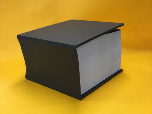
open bookEdwin Pickstone, a colleague at Glasgow School of Art, appointed me as a maths consultant recently. His project was to produce a book which had a black square on each page. The size of the square and the number of pages had to be such that the envelope of the resulting block of ink was a cube containing 1 kilogram of ink.

His printer provided a sample run so that we knew what the areal density of the ink film would be, and I did the sums to work out how big the squares would need to be and how many pages we’d need. It turned out that we needed squares of side 19.28 cm, and (coincidentally) 1928 pages.

The responsibility weighed heavily on me, and I was a little nervous as the order went off to the printer. So I was relieved and delighted when Edwin told me that when he’d walked into the printers to pick the job up, the printer said ‘bloody hell, it took a whole kilo tin of ink to print your job’.

Edwin is Lecturer, Typography Technician and Designer in Residence at Glasgow School of Art.

closed book

Pedal-powered geology

Graham's bike revised
What on earth am I doing here? Read on to find out. Many thanks to Simon Gage for the idea and to Graham Rose for the wonderful illustration.

In the previous post, we discovered that the kinetic energy of a drifting continent is of the same general magnitude as that of a moving bicycle and its rider – 1500 joules would be a typical figure.

I went on to calculate that, whereas it takes me only about 10 seconds to get my bike up to full speed, it would take me hundreds of years to get the continent up to its tiny full speed were I to put my shoulder against it and push (assuming that it was perfectly free to move). How can this be, when the amount of energy that I’m giving each of these objects is the same?

The problem is that when I push the continent, I am, effectively, in the wrong gear.

On a bike with gears, you’ve got a range of choices about how you power it: you can ride in a high gear, pedalling slowly but pushing hard on the pedals, or ride in a low gear, pedalling more quickly but pushing less hard on the pedals. There’s a simple tradeoff: if you want to pedal half as fast, you’ve got to push twice as hard for the same effect.

But there’s a limit to how hard you can push on the pedals, which means that if you move up too far up through the gears, there comes a point where you can no longer make up for the decreased pedalling rate by pushing harder on the pedals, and the power that you can supply to the bicycle falls.

Anyone who’s tried to accelerate a bicycle when they are in too high a gear will have experienced this problem, and it’s what I experience when I try to push the continent directly. Because the top speed of the continent is extremely low (about the speed of a growing fingernail), I’m necessarily pushing it very slowly as I accelerate it. This means that to give it energy at the rate that I want to (1500 joules in 10 seconds, like the bike) I would have to push it impossibly hard – the force needed is about the same as the weight of a 300-metre cube of solid rock.

Is there a way that we can put me into a lower gear, so that I can push with a force that suits me, over a longer distance, and still apply the very high force over a short distance to the continent?

Yes. Just as we’ve all used a screwdriver as a lever to get the lid of a tin of paint off, so I could use a lever to move the continent. Similarly to the bike gears, the lever allows me to exchange pushing hard over a small distance with pushing less hard over a longer distance. To do the job, the lever would need to be long enough to allow me to push, with all my might, through a distance of about 2.5 metres, with the short arm of the lever pushing the continent. We’d need an imaginary immoveable place for me to stand, and we could use the edge of the neighbouring continent as the pivot (just as we use the rim of a paint tin as the pivot). The catch is the length of the lever: if the short arm was 1 metre long, the long arm would be about 1.5 million kilometres long.

Simon Gage of Edinburgh International Science Festival suggested a more compact arrangement: a bicycle with an extremely low gear ratio, with the front wheel immobilised on the neighbouring Graham's bike extractcontinent (assumed immoveable), and the back wheel resting on the continent we’re trying to accelerate. A transmission giving 17 successive 4:1 speed reductions would do the job nicely. Ten seconds of hard pedalling would get the continent up to full speed. To me on the saddle, it shouldn’t feel any different to accelerating my bike away from the lights.

A wee caveat. This is a thought experiment, and we’ve swept some fairly significant engineering issues under the carpet. The rearmost parts of the power train would be moving at speeds that are literally geological, so in reality it would take me years of pedalling to take all of the slack and stretch out of the system. These parts would also be transmitting mountainous forces, and so they’d need to be supernaturally strong. There will be frictional losses. And then there’s the issue of transmitting a gigantic force to the continent through the contact of a bike tyre on the ground.

The calculations

What force is required to accelerate the Eurasian plate to top speed in 10 seconds?

The top speed of the plate is 3.2 × 10⁻¹⁰ ms-1. If I accelerate it uniformly, its average speed will be half of this, and so in the 10 seconds over which I hope to accelerate it, it will travel 1.6 × 10⁻⁹ m.

Now W = fd

where W is the work that I do on the plate (ie the kinetic energy that I give it), f is the force that I apply to it, and d is the distance through which I push the plate. Rearranging gives us

f = W/d

We know W from the previous post (it’s 1500 joules) and we’ve just calculated d. Thus f works out at about 9.4 × 10¹¹ newtons.

For comparison, a 300-metre cube of rock of density 2700 kg m-3 will have a weight of (300 m)3 × 2700 kg m-3 × 9.81 m s-2 = 7 × 10¹¹ newtons roughly.

The lever

When a lever is used to amplify a force, the ratio of the lengths of the arms of the lever needs to be the same as the ratio of the two forces. Suppose that I can push with a force equal to my own body weight, about 600 newtons. If I’m to use a lever to amplify my push of 600 N to a force of 9.4 × 10¹¹ N, the ratio of the lengths of the arms needs to be (9.4 × 10¹¹)/600, or roughly 1.5 × 10⁹. So if the short arm of the lever is 1 metre long, the long arm needs to be about 1.5 × 10⁹ metres long, which is 1.5 million kilometres. For comparison, the Moon is about 400,000 kilometres away.

To do 1500 joules of work with a force of 600 N, I’d need to push over a distance of 2.5 metres (because 600 × 2.5 = 1500).

The bicycle gearing

I estimated that it takes me 15 pedal revolutions to get my bike up to full speed. Knowing the length of the pedal cranks, I know the total distance that I have pushed the pedals through, and I know how much work I have done on the bicycle – 1500 joules. (I’m ignoring energy losses here, because they are small at low speeds on a bike and the calculation is highly approximate anyway). Using work done = force × distance, this gives an average force on the pedals of about 94 newtons.

The 17 stages of 4:1 reduction mean that the back wheel is rotating 417 = 1.7 × 10¹⁰ times slower than I’m pedalling. The pedalling force is amplified in the same ratio, to give a force on the teeth of the rearmost gear of 1.6 × 10¹² newtons. We now have to allow for the fact that the radius of the rear wheel is about twice the length of the pedal crank. This roughly halves the force available at the rim of the rear wheel, giving a force of about 8 × 10¹¹ newtons, which is close to what we need.


The kinetic energy of a drifting tectonic plate…

…is broadly similar to the kinetic energy of me and my bike as I pedal along.

plates
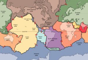
Map of tectonic plates (United States Geological Survey) http://pubs.usgs.gov/publications/text/slabs.html

According the the theory of plate tectonics, the outer layer of the Earth is divided into a number of separate plates, which very slowly drift around, opening and closing oceans, causing earthquakes, and thrusting up mountain ranges.

A moving body has energy by virtue of its motion: kinetic energy. Kinetic energy is proportional to a body’s mass and to the square of its speed.

Now tectonic plates move extremely slowly: the usual comparison is with a growing fingernail. But they are also extremely heavy: tens of millions of square kilometres in area, over 100 km thick, and made of rock. I wondered how the minute speed and colossal mass play out against each other: what’s the kinetic energy of a drifting tectonic plate?

There are so many variables, that vary such a lot, that this calculation is going to be extremely approximate. But the answer is delightfully small: the kinetic energy of the tectonic plate on which I live, as observed from one of the plates next door, is about the same as the kinetic energy of me and my bike when I’m going at a reasonable pace: about 1500 joules.

Me struggling up one of the many steep roads in NW Scotland. Here, the kinetic energy of me and my bike is much less than the kinetic energy of a drifting tectonic plate. In fact the speed of me and my bike is probably less than that of a drifting tectonic plate.
Me struggling up one of the many steep roads in north-west Scotland. Here, the kinetic energy of me and my bike is much less than the kinetic energy of a drifting tectonic plate. In fact the speed of me and my bike is probably much less than that of a drifting tectonic plate ;-).

This is a fun calculation to do, but we shouldn’t get carried away thinking about the kinetic energy of tectonic plates. Plates are driven by huge forces, and their motion is resisted by equally large forces. The mechanical work done by and against these forces will dominate a plate’s energy budget in comparison to its kinetic energy.

But the calculation does provoke an interesting thought about forces and motion. I can get my bike up to full speed in, say, 10 seconds. If the Eurasian plate were as free to move as my bike, and I were to put my shoulder against it and shove as hard as I could, it would take me about 500 years to get it up to its (very tiny) full speed.

In both cases, I’m giving the moving object roughly 1500 joules of kinetic energy. How come I can give that energy to my bike in a few seconds, but to give it to the plate would take me centuries?

I’ll return to that thought in a later post.

The calculation

Depending on how you count them, there are 6-7 major tectonic plates, 10 minor plates, and many more microplates. The plates vary hugely in size, from the giant Pacific Plate with an area of 100 million km2, to the dinky New Hebridean plate, which is a hundred times smaller. The microplates are smaller still. Plates also vary a lot in speed: 10-40 mm is typical.

I’m going to be parochial, and choose the Eurasian plate for this calculation.

Let’s call the area of the plate a and its mean thickness t. Its volume is then given by at, and if its mean density is ρ, then its mass m is ρat.

A body of mass m moving at a speed v has kinetic energy ½mv2. So our plate will have kinetic energy ½ρatv2.

The area of the Eurasian plate is 67,800,000 km2 or 6.78 × 10¹³ m2, and its speed relative to the African plate is (the only speed I have) is given as 7-14 mm per year. We’ll use 10 mm per year, which is 3.2 × 10⁻¹⁰ ms-1. The thickness of tectonic plates in general varies roughly in the range 100-200 km depending upon whether we are talking about oceanic or continental lithosphere; let’s call it 150 km or 1.5× 10⁵ m. The density of lithospheric material varies in the range 2700-2900 kg m-3; we’ll use 2800 kg m-3.

Putting all of these numbers into our formula for kinetic energy, we get a value of 1500 joules (to 2 significant figures, which the precision of the input data certainly doesn’t warrant).

Now for me and my bike. I weigh about 57 kg, my bike is probably about 10 kg. Suppose I’m riding at 15 mph, which is 6.7 ms-1. My kinetic energy is almost exactly…

…1500 joules!

The closeness of these two values is unmitigated luck*, and we shouldn’t be  seduced by the coincidence. Just varying the speed of the plate in the range 7-14 mm would cause a 4-fold change in kinetic energy, and there’s the variability in plate thickness and rock density to take into account as well. The choice of bike speed was arbitrary, I guessed the mass of the bike, and I’ve since realised that I didn’t account for the fact that the wheels of my bike rotate as well as translate.

However, what we can say is that the kinetic energy of a drifting continent is definitely on a human scale, which leads to a new question:

Suppose the Eurasian plate were as free to move as my bicycle, and that I put my shoulder against it and shoved, how long would it take me to get it up to speed?

From the figures above, the mass of the plate is 2.85 × 10²² kg. If I can push with a force equal to my own weight (about 560 newtons) then by Newton’s 2nd Law I can give it an acceleration of about 1.96 × 10⁻²⁰ ms-2. Rearranging the equation of motion v = at, where v is the final speed, a is the acceleration, and t is the time, then t = v/a. Inserting the values for v and a, we get t = 1.6 × 10¹⁰ seconds, or about 500 years.


* I didn’t tweak my assumptions: what you see above really is the very first version of the calculation!

Kettles, cars, and energy

Be careful about how much water you put in your kettle and ‘do your bit’ to save energy!

That’s what we’re often told, and boiling only as much water as you need for your cup of tea can only be a good thing. But how much impact does it really have on your overall energy consumption?

Consider this: if you’re driving along in a car at 50 mph, you’re using enough energy to make a cup of tea every few seconds.

1, 2, 3, tea, 1, 2, 3, tea, 1, 2, 3, tea…

As most people don’t think twice about driving their cars for an extra few minutes, never mind an extra few seconds, it’s clear that the energy savings made by being frugal with your kettle are very small compared to your overall energy use.

Does this mean that we shouldn’t be careful with our kettles after all? No. It all matters. But having boiled exactly one cup’s worth of water for your refreshing cuppa, you shouldn’t put your feet up and think that your energy consumption issues are sorted. You’ve much bigger fish to fry.

The calculation

Imagine that you’re travelling in a car that’s doing 50 miles per hour, with a rate of fuel consumption of 50 miles to the gallon (the units are customary in a UK motoring context). This is a realistic situation; if anything it’s optimistic in terms of energy consumption.

In this scenario, your car will burn a gallon of petrol, that’s 4.5 litres approximately, every hour.

With 3600 seconds in an hour, that’s 4.5L/3600s = 0.00125 litres per second. The density of petrol is about 0.8 kg per litre, so the rate of petrol consumption comes to 0.00125 L s-1 × 0.8 kg L-1 = 0.001 kilograms per second.

The energy density of hydrocarbon fuels is about 46 megajoules per kilogram, so the rate of use of energy by your car is 0.001 kg s-1 × 46×106 J kg-1 = 46000 joules per second (watts).

Now let’s think about the tea. The energy E required to produce a temperature change of ΔT in a mass m of a substance whose specific heat capacity is C is

E = m C ΔT

A typical mug of tea contains about 250 ml, or 0.25 kg, of water. For water, C = 4200 J kg-1 K-1. The temperature change is about 90 K, if the water comes out of the tap at about 10°C and is raised to boiling point. So the amount of energy required to heat the water for a cup of tea is 0.25 kg × 4200 J kg-1 K-1× 90 K = 94500 joules.

As the car is using 46000 joules per second, it follows that the car is using enough energy to heat the water for a cup of tea every two seconds.

Now to be fair to the car, we need to recognise that in real life there is more energy used to heat the water for the tea than actually goes into the water. There are heat losses in energy generation and transmission, and from the kettle itself.

Things get very complicated here. A thermal electricity generating plant (coal, oil, gas, or nuclear) converts energy in the fuel to electrical energy with about 35-45% efficiency. But in the UK, about 20% of our electricity is generated from renewables, where the concept of efficiency is harder to pin down. For example, I could use some oil to heat my water directly instead of doing it indirectly by generating electricity, but I couldn’t do the same with the wind. I’m going to assume that 80% of the electricity that I used was generated in thermal plants at 40% efficiency, and 20% of it was generated at 100% efficiency, giving an overall efficiency of 52%. But be aware that this is a very rough figure, and that there is no right answer.

According to this document, about 93% of the energy in generated electricity makes it unscathed through the transmission and distribution systems to the end user.

I did an experiment and estimated the efficiency of my kettle to be about 88%. I give details later.

This gives an overall efficiency of boiling water as 52% × 93% × 88% = 43%. So instead of using 94500 joules to boil water for a cup of tea, we’re actually using 94500J/0.43 = 220000 joules, which means that the car’s rate of energy use is equivalent to a cup of tea roughly every 5 seconds. Because of all the uncertainties involved (not least the size of a cup of tea), we should treat this figure as very approximate.

Efficiency of my kettle

My kettle took 180 s to raise 1 litre of water from 17°C to boiling.

The kettle is rated at 1850-2200 W for supply voltages in the range 220-240 V. When the kettle was running, I measured the supply voltage to be 242 V, so I assumed that the kettle was operating at the top of its power range, ie 2200 W.

The heat supplied by the kettle element was therefore 2200 W × 180 s = 396000 J.

Using the same equation as earlier, the energy required to raise the temperature of 1 kg of water by 83 K is 1 kg × 4200 J kg-1 K-1 × 83 K = 348600 J.

The kettle was therefore heating the water with efficiency 348600/396000 = 0.88 or 88%.

Walking bass

How fast does a plucked guitar string move? It’s a complete blur, so surely it’s travelling at a terrific speed. 50 miles per hour? 100 miles per hour? What do you think?

"Vibrating guitar string" by jar [0] is licensed under CC BY 2.0
“Vibrating guitar string” by jar[0]. See end of post for full attribution.

Walking pace. A typical speed for the middle of a guitar string given a good twang is walking pace. And that’s the middle of the string. Near its ends, it’ll be moving much more slowly.

How can that be so? Well, although the string is going back and forth hundreds of times a second, it’s only travelling a few millimetres on each trip. So the distance that it travels in each second isn’t as much as you might expect. It certainly isn’t as far as I expected.

If you think that the string moves slowly, what about the body of the guitar? The string itself radiates very little sound into the air; its job is to set the body of the guitar vibrating. The body of the guitar, with its much larger area, is much more effective than the string at setting air into motion. Yet we can’t even see the body vibrating. At what snail’s pace must it be moving?

Remember also that the air molecules on which the guitar body acts are already travelling at something like 500 metres per second. Isn’t it astonishing that the sub-pedestrian movements of the guitar affect the movement of the air molecules enough to produce a sound that we can easily hear?

The calculation

Suppose that we look near the centre of the string, where its movement is the greatest. Shortly after being plucked, the width of the blur that we see is going to be something like 5 mm. So for every complete oscillation, the string does a round trip of about 10 mm.

The frequencies of the strings on a standard 6-string acoustic guitar are (to the nearest whole number) 82, 110, 147, 196, 247 and 330 hertz (one hertz is one oscillation per second). If we multiply these frequencies by the 10 mm round trip, it tells us how far the centre of each string travels in one second, that is, its average speed. I’ve converted these speeds into metres per second. For comparison, a brisk walk at 4 mph is about 1.8 ms-1.

Note nameMean speed of middle of string in metres per second (to 2 sig. fig.)
E0.82
A1.1
D1.5
G2.0
B2.5
E3.3

Our brisk walk is right in the middle of this range. And remember, we’ve done the calculation for the part of each string that’s moving the most. Near its ends, each string will be moving much more slowly than this.

Complication 1 – how long is the round trip really?

So far, we’ve assumed that each part of the string does a simple back-and-forth movement along a straight line, but if you carefully watch a vibrating guitar string you’ll see that the string often moves in an irregular but roughly elliptical orbit. The wire-wound lower strings show this most clearly; you can see a hint of it in the image at the top. This makes the round-trip distance a bit longer than the 10 mm that we used in the calculation earlier. Does this affect the string’s average speed much?

We’ll take the extreme case where each part of the string moves at constant speed in a circle of diameter 5 mm rather than along a straight line 5 mm long. The circumference of this circle will be 5 \pi mm, or about 15 mm. So the speeds of the strings (in this rather unlikely extreme case) will be about 50% greater than the ones listed above. They are still hardly impressive.

Complication 2 – the peak speed

So far, we’ve calculated the mean (average) speed of the string over its round trip. However, unless it’s moving in a perfect circle, its speed changes constantly, and its peak speed will be higher than its mean speed. How much higher?

Imagine that part of the string is vibrating back and forth along a straight line in the simplest possible way. At one end of the movement the string is stationary as it changes direction. It then speeds up, reaching its peak speed at the centre of its range of movement. Then it slows down until it reaches a halt again at the other end of the movement and changes direction again. How do we calculate the peak speed if we know the time taken for the round trip?

You’ll need to know a bit of maths for the next bit. The simplest vibration of the string is where each part undergoes simple harmonic motion, that is, where its position varies sinusoidally with time. This means in turn that the velocity of the string also varies sinusoidally in time. So we need to ask: how does the mean value of a sinusoid compare to its peak value?

graph cropped 1Consider the function y = \sin \theta, for half a cycle, that is, for theta from 0 to \pi radians. We construct a rectangle between these limits, such the rectangle’s area equals the area under the sine curve. The mean value of the sine function is the height of the rectangle, which its area divided by its width (which is \pi). So we need to work out the area a under the sine curve between 0 and \pi, which we can do by integration:

a = \int\limits_0^\pi \sin \theta \,d\theta

= \left[-\cos \theta\right]_0^\pi

= \left[-(-1)-(-1)\right]

= 2

We constructed the rectangle to have area a. Its width is \pi, so its height, and therefore the mean value of the sine function, is a/\pi = 2/\pi. The height to the peak of the sine curve is 1, so the peak value of the sine function is \pi/2 times its mean value. This means that the peak speed of our guitar string is \pi/2 times, or 50% more than, its average speed. Again, nothing to write home about.

(Rather pleasingly, this ratio of \pi/2 is the same ratio that we got earlier in Complication 1. It means that the peak speed of a particle doing simple harmonic motion with a given amplitude r and period t is exactly the same as the (constant) speed of a particle moving in a circular orbit of radius r with period t. This isn’t a coincidence. It arises because the circular motion can be considered as two linear simple harmonic motions at right angles to each other.)

Credits

Vibrating guitar string” by jar [0] is licensed under CC BY 2.0

Mathematical typesetting by QuickLaTeX

What’s the smallest number of atoms that I can see?

It depends what you mean by see. Single air molecules scatter light (that’s why the sky glows) so with a dark background and an absurdly intense light source you would presumably be able to visually detect a single atom suspended in a vacuum.

But that doesn’t really feel like seeing to me. The question I’m going to answer is: what is the smallest number of atoms that I can quickly assemble using the stuff in my flat, that I can see with my unaided eye by ordinary reflection in typical room lighting?

I’m sure I could look this up somewhere but there’s no fun in that.

pencil dot
The dot is where the two pencil lines would meet. The ruler scale is 100ths of an inch.

My assemblage of atoms was a tiny pencil dot made on white printer paper. There it is, on the right. The dot was definitely visible but so small that I needed to draw marks nearby so that I didn’t lose it.

I estimate that the number of atoms in that minute mark was about 1013, with an uncertainty of at least a factor of 10 in both directions.

In other words, 10 million million, very roughly.

That’s a lot. We talk about atoms very casually, drawing diagrams of chemical structures and so on, and it’s easy to forget how exceedingly tiny they are. It’s useful to do experiments like this one now and again to remind ourselves that atoms really are small beyond our comprehension.

The experiment

I made the dot by rubbing the end of a propelling pencil to a point and then touching the point lightly against a sheet of white paper.

To estimate the thickness of the layer of pencil lead, I held the pencil perpendicular to some paper and scribbled until the lead had a flat end to it. I then adjusted it so that, as far as I could tell, 1 mm of lead protruded from the pencil. Then, using normal pencil pressure, I drew lines 10cm long until the exposed millimetre of lead had all worn away. I took care to hold the pencil perpendicular to the paper so that the lines I drew were the full width of the lead. I could draw 520 such lines with the millimetre of lead, a total of 52 metres of line.

Calculation 1: volume and mass of the dot

I used the thickness (don’t confuse this with the width) of the lines described in the previous paragraph as a proxy for the thickness of the dot (and in doing so introduced probably the biggest uncertainty in the whole procedure). Propelling pencils leads appear to come in sizes of 0.5 mm, 0.7 mm and 0.9 mm and larger. Holding mine against a ruler showed that it was clearly a 0.7 mm lead. The volume of the initial protruding cylinder of lead was therefore

π × (0.35 mm)² = 0.385 mm³ or 3.85 × 10⁻¹⁰

If the line lines I drew were uniformly 0.7 mm wide (and that’s quite a big if – tilting the pencil will make them narrower) then I can equate the volume of the lines and the volume of the lead cylinder thus:

3.85 × 10⁻¹⁰ m³ = (52 m) × (0.7 × 10⁻³ m) × t

where t is the average thickness of the layer of lead on the paper in metres. This gives us

t = 1.06 × 10⁻⁸ m

It certainly doesn’t deserve 3 significant figures but I’m going to leave more reasonable rounding to the end.

To measure the area of my dot, I took a photograph of it next to the finest scale on my ruler, which is 100ths of an inch (see earlier). Things aren’t made any easier by the non-roundness of the dot, but if I were to say that the dot was 1/300 of an inch in each direction, I don’t think I’d be too far wide of the mark. That makes its area

(1/300 in)² × (25.4 × 10⁻³ m in-1)² = 7.17 × 10⁻⁹

(the 25.4  × 10-3 being the conversion from inches into metres). Using our estimate for the thickness of the pencil layer above, this makes the volume of the dot 7.60 × 10⁻¹⁷ m3.

Next, we need to know the density of the pencil lead. If it was a clay brick, its density would be 2400 kg m-3, and if it was pure graphite its density would be in the range 2090-2230 kg m-3, so it’s a reasonable guess that the density of the graphite/clay mix is about 2300 kg m-3.

So using the volume calculated earlier, the mass of my pencil dot is about

(2300 kg m-3) × (7.60 × 10-17 m3)= 1.75 × 10⁻¹³ kg

Calculation 2: how many atoms in a kilogram of pencil lead?

From the Cumberland Pencil Company, cited here, I infer that an HB pencil lead is roughly 50% clay and 50% graphite. They don’t say whether that’s before or after firing (the clay will lose water on firing). I’m going to assume that it’s after firing, but given all the other uncertainties in this calculation, I don’t think it’ll matter much if I’m wrong.

Clay is variable in composition, but a typical constituent of fired clay appears to be various minerals or combinations of minerals of overall composition Al2Si2O7. The relative “molecular” mass of such a compound/mixture will be 220. The relative atomic mass of carbon (in the graphite) is 12, so a 50:50 (by mass) mix of clay and graphite will need about 18 atoms of carbon for every unit of Al2Si2O7, giving a total of 29 atoms per unit of this mixture/compound, and a relative “molecular” mass of 440.

440 g of pencil lead is therefore one mole of pencil lead, and with 29 atoms per elementary entity of this mole, it will contain about 29 × 6.02 × 1023 = 1.75 × 1025 atoms; this is about 3.97 × 1025 atoms per kilogram. (6.02 × 10²³ is Avogadro’s number: the number of elementary entities in a mole of a substance)

Calculation 3: number of atoms in the dot

From calculation 1, we know that the dot weighs 1.75 × 10⁻¹³ kg, and therefore with 3.97 × 1025 atoms per kilogram, the number of atoms in the dot is

(1.75 × 10⁻¹³ kg) × (3.97 × 1025 kg-1) = 6.95 × 10¹²

Rounded more reasonably, this is 1013 atoms in the pencil dot.

With the uncertainties in the size of the dot and the composition of the lead, I wouldn’t want to quote the answer any more precisely than this.

Checking

We’ve done quite a few steps here. Can we check that this answer looks about right?

Suppose the dot were pure graphite. Its mass would be (2150 kg m-3) × (7.17 × 10-17 m³) kg, which is 1.54 × 10⁻¹¹ moles and hence about 9.2 × 10¹² atoms in the dot. As carbon atoms are smaller than aluminium or silicon atoms, it’s not surprising that this number is a little bit bigger than the unrounded number of atoms calculated in the dot.

Now suppose that it was pure aluminium, with density 2700 kg m-3. Its mass would be (2700 kg m-3)× (7.2 × 10-17 m-3) = 1.94 × 10⁻¹³ kg which is 7.46 × 10⁻¹² moles and hence 4.5 × 10¹² atoms in the dot. As aluminium atoms are larger than carbon atoms, it’s not surprising that this number is a little bit smaller than the unrounded number of atoms calculated in the dot.

So our clay mineral calculations look at least plausible. The bit I’m really worried about is the thickness of the dot. Making a mark with a pointed lead and drawing a line with a flat end of the lead are likely to involve different pressures and hence different mark thicknesses. My feeling is that I’m most likely to have underestimated the thickness of the dot, and hence the number of atoms in it.