It has often struck me how many elementary actions go into even simple making tasks. If you list everything, right down to picking up your pencil and later putting it down again, the actions soon add up.
To put some numbers to this thought, I made the the video below. As I made a rebated butt joint between two pieces of corrugated cardboard, I spoke out loud each action that I was doing. Then I transcribed the speech recording, and added the words to the video, which is highly speeded up. According to my commentary, the whole job involved 109 separate actions. (This includes snapping off a new knife blade and squaring up the piece of cardboard at the start, and making a hash of a cut in the middle and doing it again later.)
What constitutes an elementary action is a matter of opinion. I simply broke things down such that I could commentate in an unhurried way. But an action such as picking up a knife involves several separate movements of your arm and hand. And if you consider that most of these movements involve the coordination of several muscles, it becomes clear that my simple glued joint was the outcome of a very complicated sequence of actions indeed.
In a previous post I showed the photograph below and wrote about some other demonstrations of coloured shadows.
In a subsequent post I discussed how coloured shadows appear to obey the rules of subtractive colour mixing, rather than the rules of additive colour mixing that you’d expect to apply, given that the coloured shadows appear to be coloured lights projected onto a screen.
Earlier this year I did a screenprinting course at Edinburgh Printmakers. For my course project I decided to do an analogue of the photo above, doing literal subtractive colour mixing using pigments. Here is the result:
Comparing this image with the one at the top, we can see subtractive colour mixing rules at work in both. For example, where blue/cyan and yellow overlap, we get green. (If I’d been paying more attention I would have made the order of the coloured shadows the same in both images.)
To create the screenprint image, I took 5 photographs of the pot and its shadows.
Three of the photographs were to get images of the shadows. I placed the light in a different position for each one. In the fourth picture I arranged the lighting to get a good silhouette of the leaves, and in the fifth picture I arranged the lighting to get good highlights on the pot, to bring out its shape.
I then removed the irrelevant parts of the images and thresholded what remained to give me my originals for the four layers of my screenprint. The image of the pot/leaves is a composite of the fourth and fifth pictures above.
I printed the three coloured shadows first, and then the pot/leaves in dark grey on top.
Although we live in a 3D world, we aren’t always very good at judging the volumes of things. A few years ago I had the idea of exploring our (mis)judgements of volume by making a collection of differently-shaped objects, all of which had a volume of a pint. I didn’t do anything about it at the time, but when I discovered recently that Pint of Science in Glasgow was holding Creative Reactions, an art exhibition, I decided to take the hint and get to work.
Cuboids
These cuboids all have a volume of a pint.
Optimal shapes
These shapes not only have a volume of a pint, but they are all optimal in terms of surface area:
Of all the cuboids with a volume of a pint, a cube has the smallest surface area. Of all the cylinders with a volume of a pint, a cylinder whose height and diameter are equal has the smallest surface area. Of all the cones with a volume of a pint, a cone whose height is the square root of 2 times its base diameter has the smallest surface area.
And of all solid shapes with a volume of a pint, a sphere has the smallest surface area.
I made the cylinder, sphere and cone on a lathe, and the sphere on a bandsaw.
A quiet pint
Here we have the lowest (most distal) pint of my arm and hand about to pour a pint of beer into the front pint of my face. All the beer-glass shapes are casts of the interiors of pint glasses. I was slightly disappointed by the beer-glass casts; I was hoping that they might seem strikingly small compared to the actual filled beer glasses, but they don’t.
Casting was a new venture for me. My thanks to Amy Grogan and Alys Owen of the casting workshop at Glasgow School of Art for their help and advice.
My thanks also to Laura McCaughey, Marta Campillo Poveda, and Danielle Leibnitz, who organised the exhibition.
The video above is a night-time time-lapse video taken from Portobello, Edinburgh looking roughly north over the Firth of Forth towards the coast of Fife, a few miles away. I made the video in March 2022.
Look at the vertical relative movement of the distant lights. I believe that this is caused by atmospheric refraction as bodies of warm or cool air rise or fall (I’m not sure which). Light rays are refracted (bent) as they pass between bodies of air at different temperatures, because air’s density depends upon temperature. It’s like the shimmering haze that you see above hot ground on a very hot day, but on a grander scale and unfolding at a more leisurely pace.
The frames were taken at 5-second intervals, which means that the video represents about half an hour of real time.
I don’t believe that we’re looking at camera shake, because that would move the entire image as a piece, rather than causing some parts to move relative to others.
This post is merely to provide a link to a video of a mathematical machine that I made over the Christmas holidays. Even if maths isn’t your thing, you might enjoy the movements and the rhythms.
If you’re running an endurance race such as a 10K, half-marathon, or marathon, it might seem obvious that the quickest way of getting to the finishing line is to run continuously over the entire distance. But some people (notably Jeff Galloway) suggest that, particularly if you’re a slower runner, you might actually finish sooner if you walk some of the way. The rest that walking gives you can boost your running pace enough to make your overall pace faster. Galloway claims gains of up to 7 minutes in a half-marathon and 13 minutes in a marathon.
Websites such as Galloway’s give list of suggested run/walk ratios, but I haven’t found anything that lets you see what overall pace you’ll do if you follow a given run-walk strategy. Here, I aim to fill that gap.
The table below tells you how long (in time) your bursts of running need to be to achieve a given overall average pace (left-hand column), for different paces of running (top row). It assumes that you are going to alternate bursts of running with 1-minute walking breaks, and that you walk at a pace of 15 minutes per mile.
Here are two ways in which you might use the table.
Example 1: Suppose that you aspire to run the race at an average 10 minutes per mile. How fast and how long do your running bursts need to be? Locate 10:00 in the left-hand column of the table. Now reading across, you come to the time 0:47. Looking at the top of the column, the pace in bold is 7:00 minutes per mile. So you can achieve a 10:00 per mile pace by running at 7:00 per mile for bursts of 47 seconds, and walking for a minute between them. Proceeding along the same row, you could get the same overall pace by running at 7:30 per mile for bursts of 1m00s, and so on up to a probably more realistic 9:30 per mile for bursts of 6m20s.
Example 2: Suppose that you think you can run at 9:30 per mile while you are actually running. What is the average pace for different lengths of running burst? Locate 9:30 along the top of the table. Going down the column to where it says “6:20”, and reading across to the left-hand column, you find that running bursts 6m20s long will give you an average pace of 10:00 per mile. Similarly, running bursts 2m51s long will give you an average pace of 10:30, and so on.
Note that the table says nothing about what you are capable of. It just tells you what your overall pace will be if you can achieve certain durations and paces for the running bursts.
If you want walking breaks longer than 1 minute, increase the length of the running bursts in the same proportion.
If the combination you want isn’t in the table, or you want to assume a different walking pace, or you want to work in kilometres, there’s a formula below that you can use.
The formula
Let your walking and running paces be and respectively. You can specify these in either minutes per mile or minutes per kilometre. You’ll need to convert min:sec values to decimal values of minutes.
Let the durations of the walking breaks and running bursts be and respectively. You can use any units of times for these durations (as long as it’s the same for both).
Your average pace (in the same units that you used to specify your running and walking paces) is given by
If you’re walking for 1-minute breaks, this simplifies to
Derivation
Runners usually express how fast they are running in terms of minutes per mile (or kilometre). I’m going to call this the running pace. However, because we want to average over time, rather than distance, we need to do the averaging using speeds expressed as miles (or kilometres) per minute.
Let your walking and running paces be and respectively. The corresponding speeds are and .
We will assume that you alternate running for walk for a time and then running for a time .
We’re going to work out the weighted average of your walking and running paces to work out the overall average pace. Because we’re averaging over time, not distance, we need to do the averaging using speeds, not paces, and then convert back to a pace.
If your time-average pace is , your time-average speed (distance-per-time) is and is given by
so your time-average pace (time-per-distance) is
which we can tidy up a bit to give
Where = 1, this simplifies to
Acknowledgement
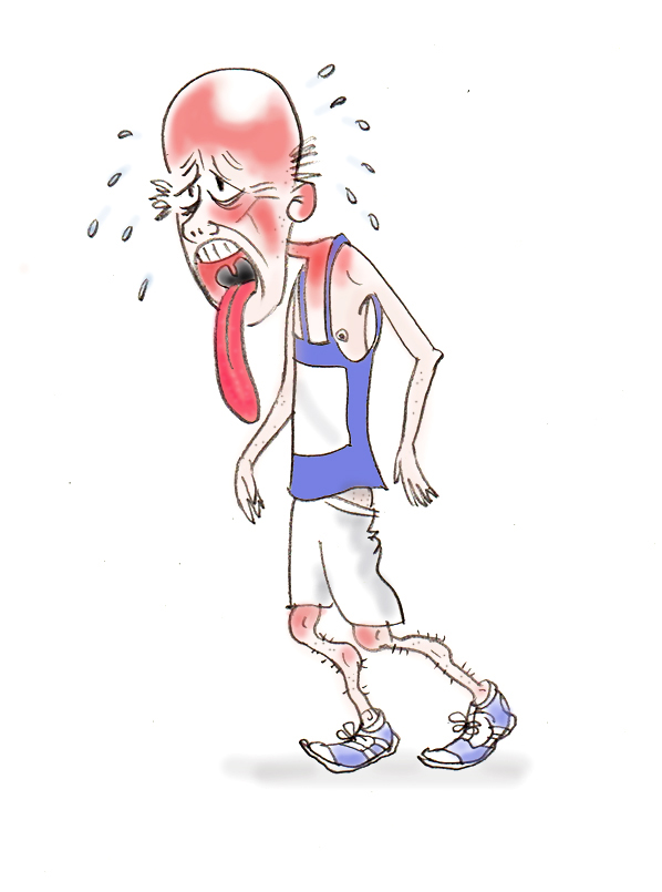
Many thanks to Graham Rose for his wonderful cartoon. It feels like that from inside, too.
Mathematical typesetting was done using the QuickLatex plugin.
The instructions told us to display something “close to your heart”. Understanding my place in the universe is something very close to my heart, and understanding the night sky is part of that.
My contribution is a time-lapse representation of the movement across the sky of the planets Jupiter and Saturn (and some smaller planets) in the two years bracketing last year’s Great Conjunction. I made it last year and am very pleased to have an opportunity to give it another airing.
A photograph of the piece. It’s just over 50 cm wide. The variations in brightness of the discs aren’t part of the plan; the illumination wasn’t perfectly even.
The piece is divided into 30 rows. Each row represents the same strip of the sky, in the sense that if I had included stars on the piece, the same stars would appear in the same positions on every row. From top to bottom, the rows show that strip of sky at 25-day intervals, covering a period roughly from roughly one year before the Great Conjunction to one year after.
All but one of these rows contain a large red disc (representing Jupiter) and a large yellow disc (representing Saturn). A row may also contain smaller discs, representing Mars in pink, Venus in white, and Mercury in blue. The purple discs represent the ex-planet Pluto. All of the discs hugely exaggerate the size of their planets.
The discs in each row indicate the positions of any planets that are in that strip of sky at the time.
Concentrating on Jupiter (red) and Saturn (yellow) first, we see that they have a general leftward motion, but with periods of rightward motion. Jupiter’s overall leftward motion is faster than Saturn’s: it starts to the right of Saturn and finishes to the left. Because Jupiter overtakes Saturn, there comes a point where they are at the same place in the sky. This is the Great Conjunction: in this row, both Jupiter and Saturn are represented by a single large white disc.
Mars, Venus and Mercury move much faster. Mars crosses our field of view in only 4 rows (roughly 100 days) and Venus and Mercury make repeat visits. Pluto wavers back and forth without appearing to make much leftward progress at all.
The FAQ
Where does the title come from? Great Junction Street is a street in Edinburgh, where I live.
Why do the planets move along the same line? They don’t exactly, but it’s pretty close. All of the planets, including the Earth, move around the Sun in roughly circular orbits. Except for Pluto’s, these orbits are more or less in the same plane (like circular stripes on a dinner plate). Because our viewpoint (the Earth) is in this plane, we look at all the orbits edge on, and the planets appear to follow very similar straightish paths across the sky. I have chosen to neglect the slight variations in path and depict the planets as following one another along exactly the same straight line
Why do Jupiter and Saturn move mainly right to left? Looking down from the North, all of the planets orbit anticlockwise. Mars, Jupiter, and Saturn have bigger orbits than the Earth, we’re observing them from inside their orbits (and from the Earth’s northern hemisphere). Thus their general movement is leftwards. (If you don’t get it, whirl a conker around your head on a string, so that it moves anticlockwise for someone looking down. The conker will move leftwards from your point of view.) The orbits of Venus and Mercury are inside the Earth’s orbit; their movements as seen from the Earth are rather complicated.
Why do Jupiter, Saturn, and Pluto sometimes move from left to right? Earth is in orbit too, so we’re observing the planets from a moving viewpoint. If you move your head from side to side, nearby objects appear to move back and forth against the background of distant objects. Exactly the same effect happens with our view of the outer planets as the Earth moves around its orbit from one side the Sun to the other – they appear to move back and forth once a year against the background of distant stars. But at the same time, they are also really moving leftwards (as we look at them). The sum of the planet’s real motion with their apparent back-and-forth motion gives the lurching movement that we see: mainly leftwards but with episodes of rightward motion. Note that the planets never actually move backwards: they just appear to. The same thing happens to Mars, but none of its periods of retrograde motion coincided with its visit to our strip of the sky.
Why do some planets move faster across the sky than others? The larger a planet’s orbit, the more slowly it moves. For the outer planets, a larger orbit also means that we’re watching it from a greater distance, so it appears to move more slowly still. Saturn’s orbit is about twice as big as Jupiter’s, so it moves more slowly across the sky than Jupiter. Jupiter “laps” Saturn about once every 20 years: these are the Great Conjunctions. Mars’ orbit is smaller than Jupiter’s, so it moves more quickly across the sky. Meanwhile lonely Pluto plods around its enormous orbit so slowly that the leftward trend of its motion is barely discernible; all we see is the side-to-side wobble caused by our own moving viewpoint. As for Mercury and Venus: it’s complicated.
Please could you stop being evasive about the movements of Venus and Mercury? It really is complicated. The orbits of Venus and Mercury are smaller than the Earth’s: we observe them from the outside. If the Earth was stationary, we’d see Venus and Mercury moving back and forth from one side of the Sun to the other. Returning to our conker-whirling experiment, it’s like watching a conker being whirled by somebody else rather than whirling it yourself. But the Earth is moving around its orbit too. And then Venus and Mercury are also moving rather fast: Mercury orbits the Sun 4 times for each single orbit made by the Earth. Combine all of these things and it becomes very confusing. Whereas the outer planets’ episodes of retrograde (backwards) movement across the sky occur less than once a year, Mercury is retrograde about three times a year.
Do the planets really follow a horizontal path across the sky? This question doesn’t have an answer. We’re using the pattern of stars, all inconceivably distant compared to the planets, as the fixed background against which we view the movement of the planets. You may have noticed that the stars move in arcs across the sky during the night; this is due to the Earth’s rotation on its axis. So our strip of sky moves in an arc too, and turns as it moves. So if it ever is horizontal, it is only briefly so, and when and if it is ever horizontal will depend upon your latitude.
Jupiter and Saturn never exactly lined up, did they? No, they didn’t (see the answer to the first question). On this scale, at the Great Conjunction the discs representing Jupiter and Saturn should be misaligned vertically by about a millimetre. With our hugely over-sized planets, this means almost total overlap, which still misrepresents the actual event, where the planets were separated by many times their own diameter. And for all other rows, where the two discs don’t overlap, a millimetre’s misalignment would be imperceptible. A final and maybe more compelling reason for my neglect of the misalignment of the planets’ paths is that I don’t know how to calculate it.
Anything else to confess? Yes. There’s a major element of fiction about the piece in that it’s not physically possible to see all of these arrangements of the planets. The reason is that for some of these snapshots, the Earth is on the opposite side of the Sun from most or all of the planets, and Sun’s light would drown out the light from the planets. In other words, it would be daytime when the planets are above the horizon, and therefore in practice they would be invisible. This was almost the case for the Great Conjunction, where there was only a short period of time between it becoming dark enough for Jupiter and Saturn to be visible, and them disappearing over the horizon.
A further element of fiction is that, even in the depths of a Scottish winter’s night, Pluto is far too faint to be seen with the naked eye, not to mention not being regarded by the authorities as a planet any more. But it was passing at the time of the Great Conjunction and it seemed a pity to miss it out.
Boeing 787 Dreamliner. At least 30 football pitches of biofuel crop needed for one full-range flight. Image credit: pjs2005 from Hampshire, UK, CC BY-SA 2.0, via Wikimedia Commons.
Carbon emissions and climate change are a huge story in the news at the moment, and the aviation industry is, quite rightly, often in the spotlight. There is talk of using biofuels to partially or completely displace fossil fuels in aviation.
That’s easy to say, but how much land would be needed to produce the energy crops? This is a complicated question, but what I want to do here is an order-of-magnitude calculation to show the alarming scale of the issue. I’m going to ask what area of oil-seed crop we would need to fuel a single full-range flight of a typical long-haul airliner.
For a smallish long-haul airliner, such as the one above, and using the controversial but high-yielding oil palm for fuel, we’d need the annual crop from 20 hectares of land to fuel a single flight. That’s about 30 football pitches. For one flight.
That figure becomes 100 hectares (a square kilometre, 150 football pitches) if we use the less controversial oil-seed rape. For one flight.
Or to put it into a different context, airports have large areas of grass on them. There’s roughly 2 square kilometres of grass at Heathrow. Let’s suppose that we use all of that area to grow oil-seed rape instead. We could use that crop to fuel TWO full-range flights of a smallish long-haul airliner each year. About a quarter of a million planes take off from Heathrow annually.
I despair at the refusal of people (often privileged Westerners such as myself) to face up to reality when it comes to flying or transport more generally.
Yes, but… (1)
…isn’t this an unrealistically pessimistic calculation? We won’t necessarily be using dedicated fuel crops for aviation. For example, there are other crop residues that we could use to provide fuels.
About 70% of the land area of the UK is devoted to agriculture, about a third of which is arable land: roughly 60 000 square kilometres. So if we used the whole lot for growing oil-seed rape, it looks doubtful that we’d keep Heathrow in jet fuel, even allowing for the facts that not every flight is long-haul and that not all planes take off with full tanks. But if, instead of using a crop optimised for oil production, we use the wastes from crops optimised for food production, the land requirement must increase hugely. And don’t forget that some of those wastes already have uses.
Yes, but…(2)
…can’t we grow the fuels elsewhere and import them?
I haven’t done any sums here. But remember that other countries are likely to want to produce biofuels for their own aviation industries.
The calculation
There’s a table here showing the annual yield of various crops from which we can produce oil. The yields vary from 147 kg of oil per hectare per year for maize, to 1000 kg/ha/yr for oil-seed rape (common in the UK), to 5000 kg/ha/yr for the highly controversial oil palm. I will assume that the oil can be converted to jet fuel with 100% efficiency.
The fuel capacity of long-haul airliners varies from about 100 tonnes (eg Boeing 787 Dreamliner) up to 250 tonnes (Airbus A380).
Taking the smallest plane and the highest-yielding oil crop, the annual land requirement is
hectares per flight.
If we use oil-seed rape instead, the resulting land area is 100 hectares per flight.
In the previous post I looked at how coloured shadows are formed. As I wrote it, I realised how much there is to learn from the coloured shadows demonstration; that’s what this post is about. The image above shows coloured shadows cast by a white paper disc with a grey surround.
Mixing red, green, and blue lights
In the image at the top, we’re mixing shadows. If we were mixing lights in the normal way, it would look like the picture on the right.
So what do we learn from the coloured shadows image?
Red, green and blue add to make white
The white paper disc has all three lights shining on it, and it appears white. Mixing lights shows us this too.
The three lights still exist independently when they are mixed
Some descriptions of colour light mixing could leave you with the impression that when we mix red, green, and blue lights together to make white, they combine to make a new kind of light, a bit like the way butter, eggs, flour and sugar combine to create something completely different: a cake.
But if that were so, we’d only get a black shadow. The fact that we get three coloured shadows show that the three coloured lights maintain their independence even though they’re passing through the same region of space. It’s very like ripples on a pond: if you throw two pebbles into a pond, the two sets of ripples spread through the same region of water, each one travelling through the water as if the other pebble’s ripples weren’t there.
When we mix coloured lights, additive colour mixing rules apply:
Red and blue make magenta.
Red and green make (surprisingly) yellow.
Blue and green make cyan.
All three colours add to make white.
Mixing magenta, cyan, and yellow shadows
In the coloured shadows image, it looks at first glance as if we are adding together coloured lights. But if we were, we’d expect the centre of the pattern, where all the lights overlap, to be white, as it is in the light-mixing image. Instead, the centre of the coloured shadows pattern is black.
The reason is that we aren’t adding coloured lights, we’re adding coloured shadows, and now subtractive colour mixing rules – the rules of mixing paints – apply.
In the cyan shadow, red has been blocked by the disc, leaving green and blue. In the yellow shadow, blue has been blocked by the disc, leaving red and green. Where the cyan and yellow shadows overlap, the only colour that has not been blocked by one disc or the other is green, so that’s the colour we see. We get the same result when we mix blue and yellow paints: the only colour that both paints reflect well is green. (If the blue and yellow paints reflected only blue and only yellow respectively, the mixture would appear black.)
In the black centre of the pattern, all three lights are blocked by the disc. Something similar happens when you mix every colour in your paint box together.
Colour printing is based on these subtractive colour mixing rules.
Brightness matters, and blue isn’t very bright
In either of the light- or shadow-mixing images, the boundaries between the regions aren’t all equally distinct. The least distinct ones are:
magenta and red
green and cyan
blue and black
yellow and white
In each case, the difference in the colours is the presence or absence of blue light.
There are two things at work here. Firstly, more than we might think, our vision is based on brightness, not on colour. We happily watch black-and-white movies; after a while we hardly notice the absence of colour.
Secondly, our sensation of brightness is largely due to the red-yellow-green end of the spectrum – blue makes a very small contribution, if any. So although the presence or absence of blue light can have a strong effect on colour, it has a weak effect on brightness. So boundaries defined by the presence or absence of blue light tend to be relatively indistinct compared to those defined by the presence or absence of red or green light.
This is a photograph that I took as a response to a challenge that was set by photographer Kim Ayres as part of his weekly podcast Understanding Photography. The challenge was to produce a photo where the main interest was provided by shadows. I lit a rose cutting using red, green, and blue lights that were about 3 metres away and 30 centimetres apart from each other. The result is a gorgeous display of coloured shadows. Coloured shadows are nothing new, but they are always lovely.
Kim suggested that I do a blog post to explain more about how coloured shadows arise. To do this I set up an arrangement for creating simple coloured shadows. One part of the arrangement is three lights: red, green, and blue arranged in a triangle.
The lights shine upon a white screen set up about 3 metres away. In front of the screen, a wire rod supports a small black disc.
First of all, let’s turn on the red light only. The screen appears red, and we can see the shadow of the disc on it. The shadow occupies the parts of the screen that the red light can’t reach because the disc is in the way.
Next, we’ll turn on the green light only. Now the screen appears green, and for the same reasons as before, there’s a shadow on it. The shadow is further to the left than it was with the red light; this is because the green light is to the right of the red light as you face the screen.
Next, we’ll turn on the blue light only, with the expected result. The blue light is lower than the red and green ones, so the shadow appears higher on the screen. (The shadow is less sharp than the previous two. This is because my blue light happens to be larger than the red or green lights).
Now we’re going to turn on both the red and green lights. Perhaps unsurprisingly, we see two shadows. They are in the same places as the shadows we got with the red and green lights on their own. But now they are coloured. The shadow cast by the red light is green. This is because, although the disc blocks red light from this part of the screen, it doesn’t block green light, so the green light fills in the red light’s shadow. Similarly, the shadow cast by the green light is red.
The screen itself appears yellow. This is because, by the rules of mixing coloured lights (which aren’t the same as the rules for mixing coloured paints), red light added to green light gives yellow light.
We can do the same with the other possible pairs of lights: red & blue, and green & blue. (The green shadow looks yellowish here. It does in real life too. I think this is because it’s being seen against the bluish background.)
We’re now going to turn on all three lights. As you might expect, we get three shadows. The colours of the shadows are more complicated now. The shadow cast by the red light is filled in with light from both of the other lights – green and blue – so it has the greeny-blue colour traditionally referred to as cyan. The shadow cast by the green light is filled in with light from the red and blue lights, so it is the colour traditionally called magenta. And the shadow cast by the blue light is filled in with light from the red and green lights, and thus appears yellow.
The rest of the screen, which is illuminated by all three lights, is white, because the laws for mixing coloured lights tell us that red + green + blue = white. The white is uneven because my lights had rather narrow and uneven beams.
Finally, let’s add further richness by using a larger disc, so that the shadows of the three lights overlap. Now we get shadows in seven colours, as follows.
Where the disc blocks one light and allows two lights to illuminate the screen, we see the colours of the three pairwise mixtures of the lights: yellow (red+green), magenta (red+blue), and cyan (green+blue).
Where the disc blocks two lights and allows only one light to illuminate the screen, we see the colours of the three individual lights: red, green, or blue.
And in the middle, there’s a region where the disc blocks the light from all three lights, so here we get a good old-fashioned black shadow.
If it’s a bit hard to wrap your head around this, let’s trying looking at things from the screen’s point of view. Here I’ve replaced the screen with a thin piece of paper so that the shadows are visible from both sides. I’ve made holes in the screen in the middle of each of the coloured regions, so that we can look back through the screen towards the lights.
Here’s what you see when we look back through the magenta shadow. We can see the red light and the blue light, but not the green one – it’s hidden behind the disc.
This is the view looking back through the green shadow. We can see only the green light. The red and blue lights are hidden behind the disc.


 and
and  respectively. You can specify these in either minutes per mile or minutes per kilometre. You’ll need to convert min:sec values to decimal values of minutes.
  and
and  respectively. You can use any units of times for these durations (as long as it’s the same for both).

 and
and  .
. , your time-average speed (distance-per-time) is
  and is given by


 hectares per flight.


_(cropped).jpg)